


You are currently viewing popup box 1.
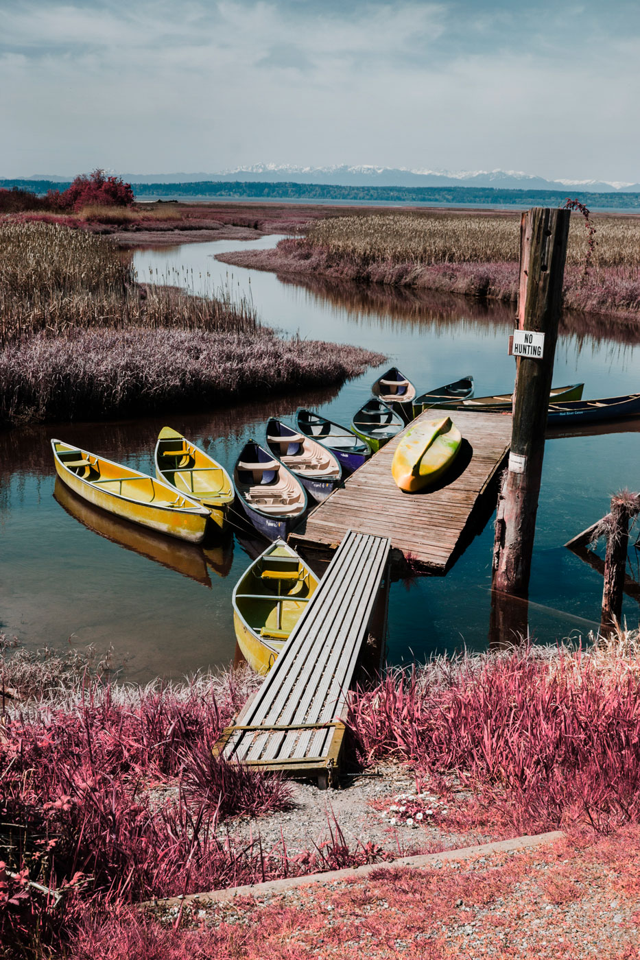
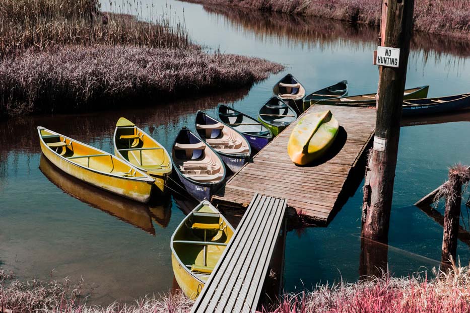
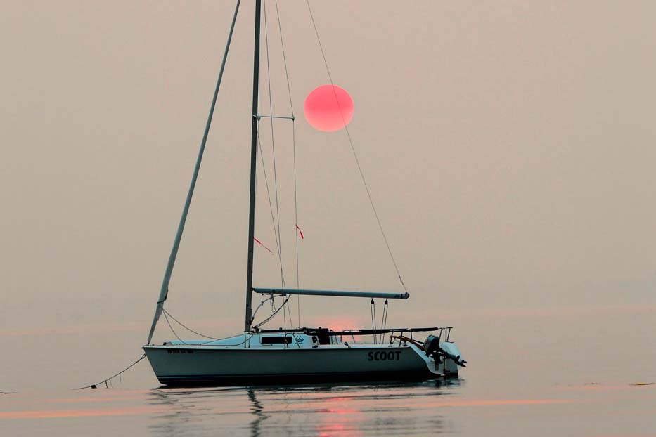
This photograph is quite important to me. It brings back memories of summer at the Warm Beach Camp. Once I canoed in the moonlight using these same boatsa. The Warm Beach Camp has partially shaped who I am today.
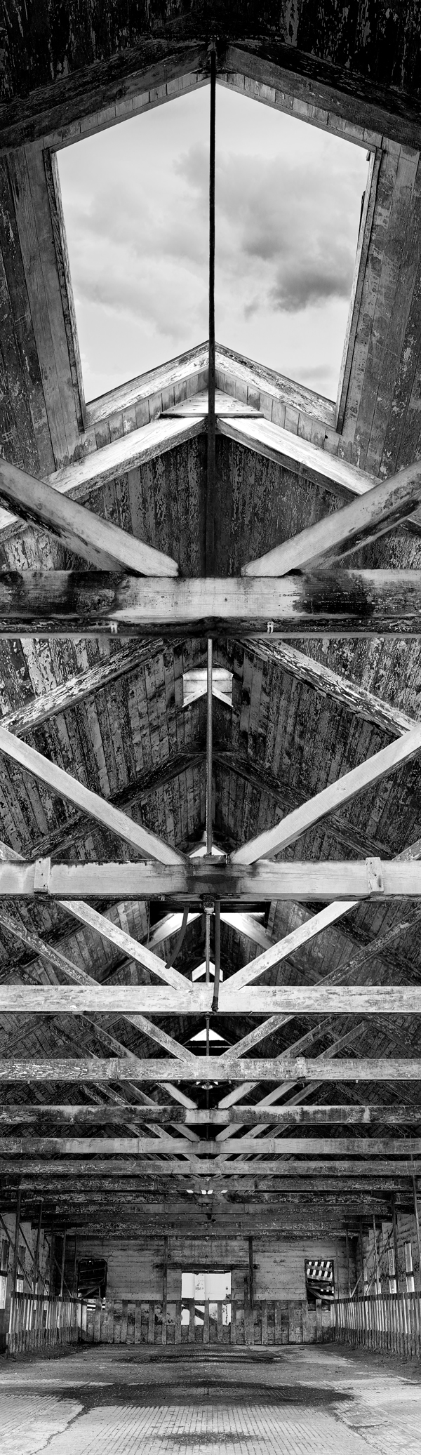
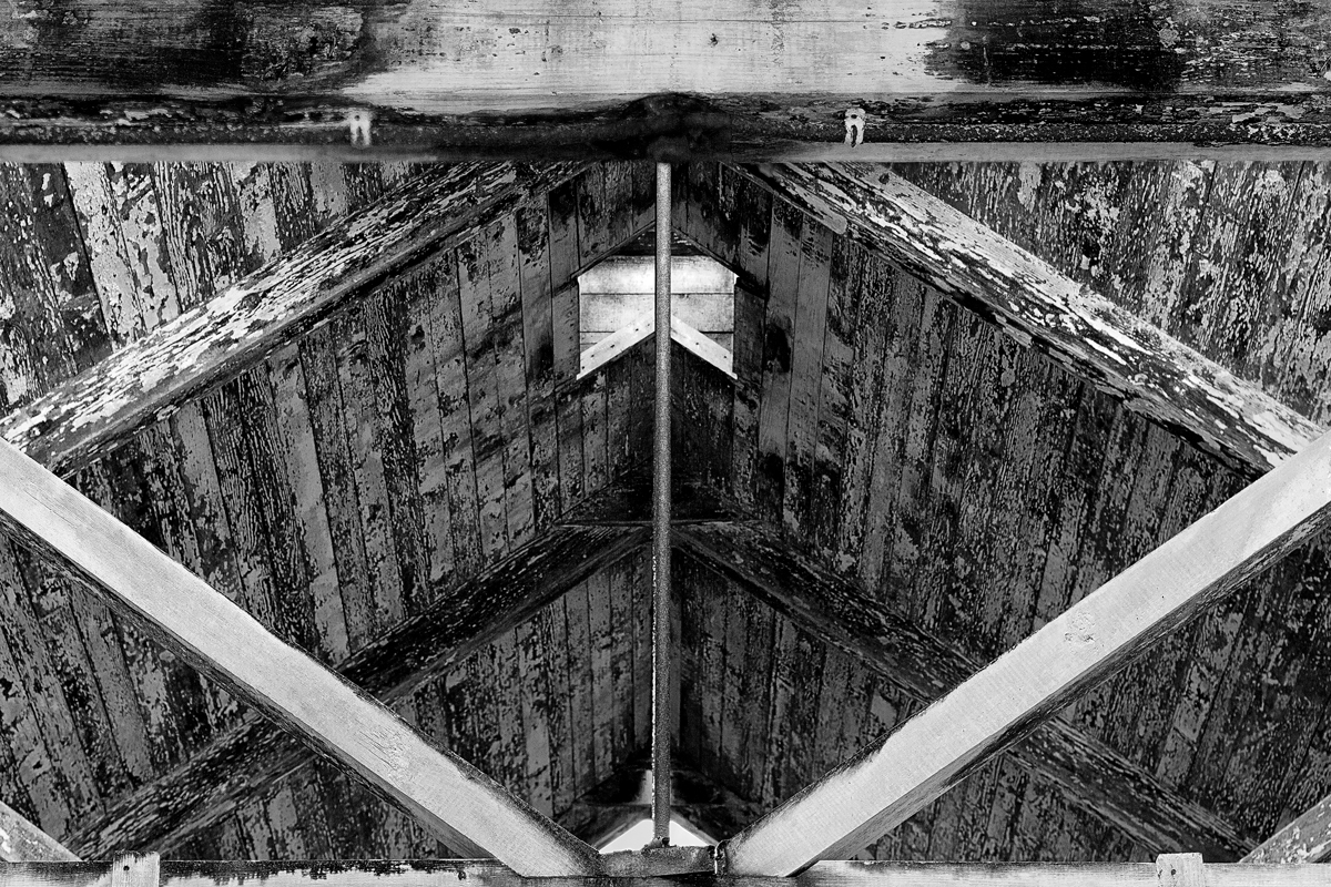
Abandoned buildings are one of my favorite subjects to photograph. This barn, located on the grounds of the Northern State Mental Hospital, has a feeling of vastness that I’ve never been able to capture with the camera’s traditional framing. I decided to expand the view into a vertical panorama, and stitched ten photographs together in Photoshop to make this final image. The whole building has a dark, creepy vibe- until you look up and see the open skylights- a literal and metaphorical beacon of light.
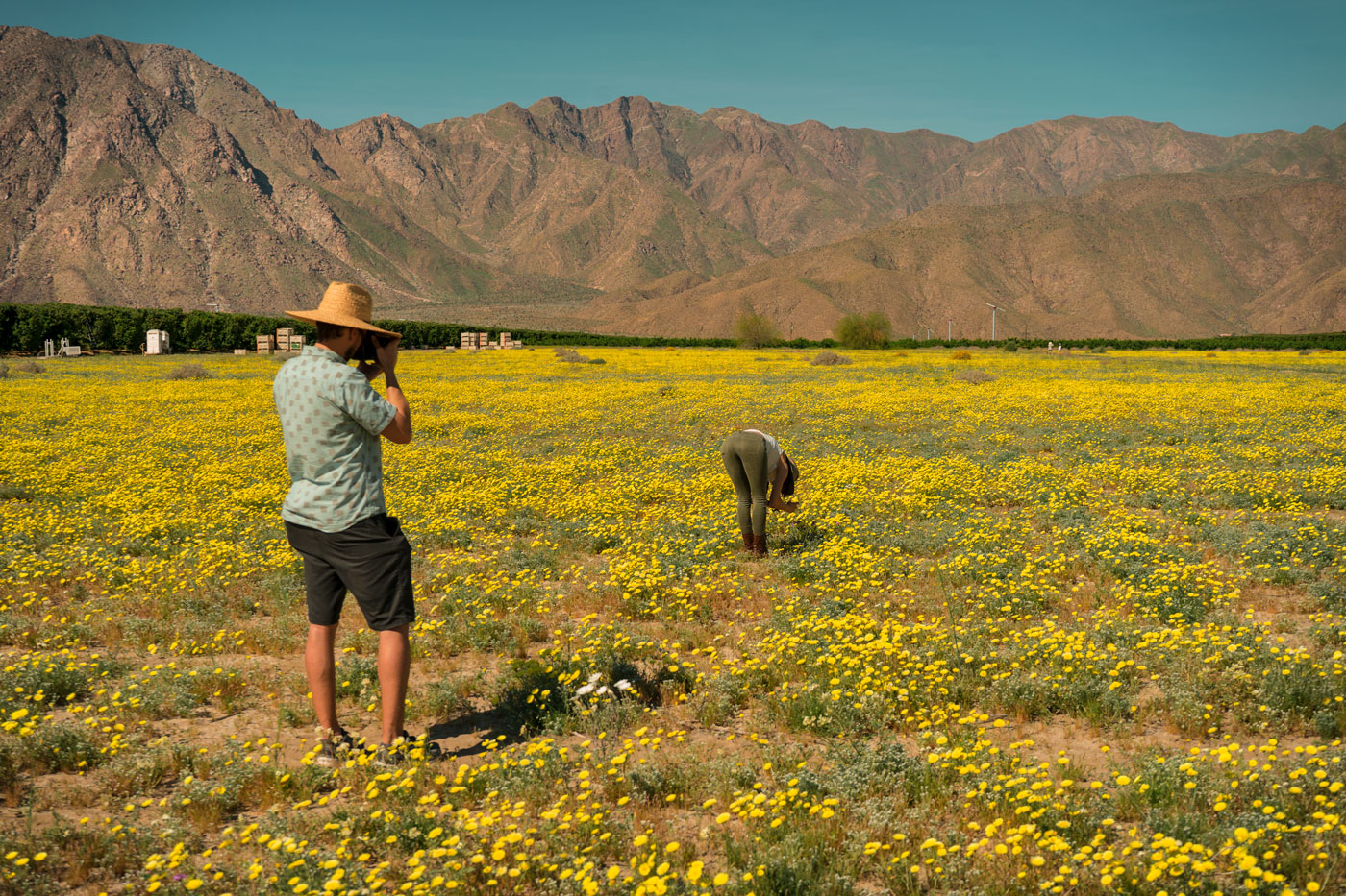
Borrego Springs, wildflower superbloom.
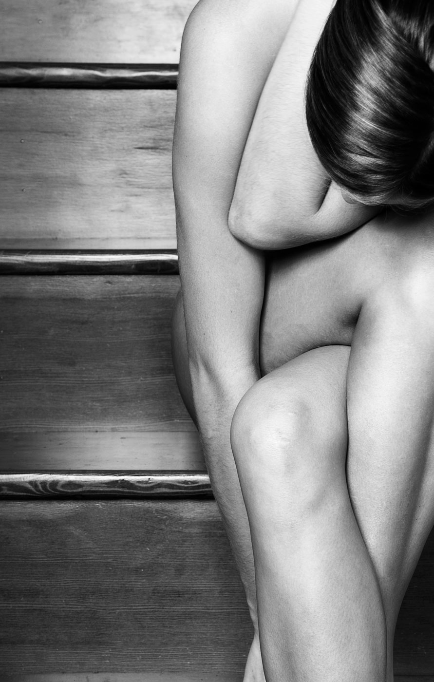
Black and white photography.
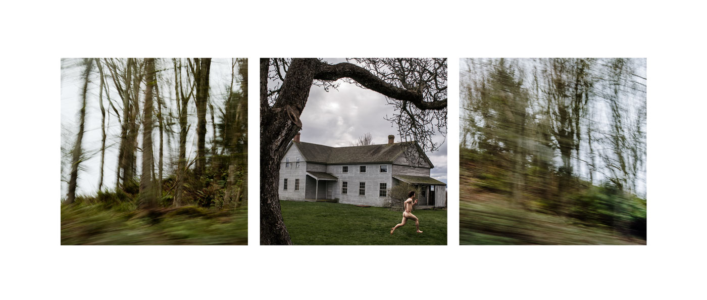
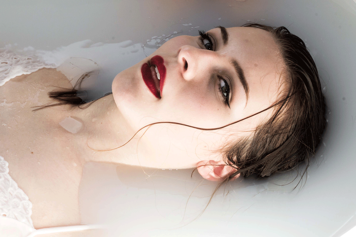
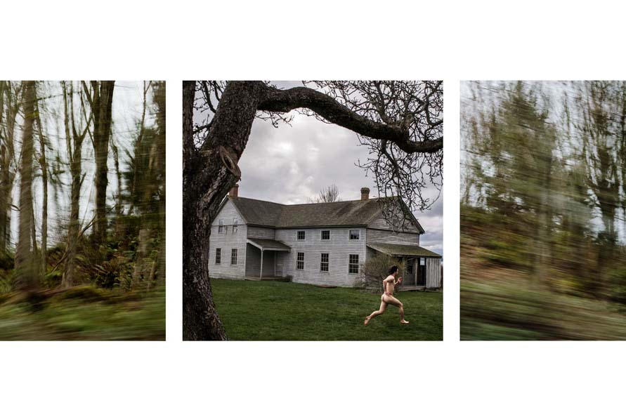
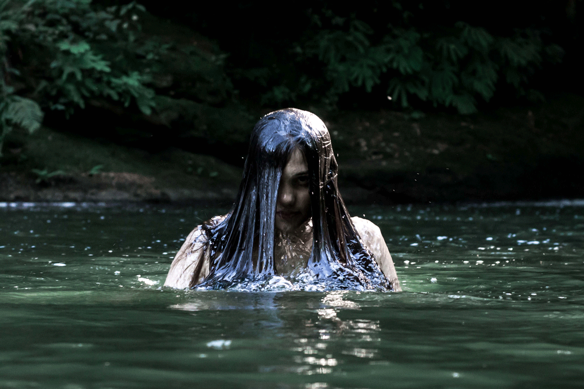
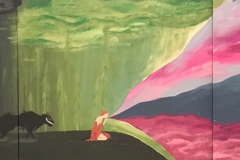
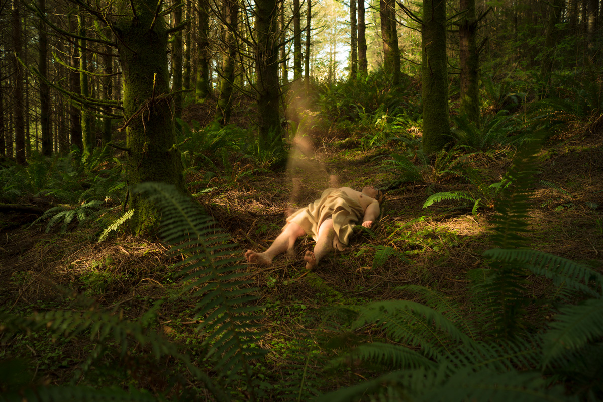
This image is part of a series that explores the supernatural connections between humans and the planet. The work encourages the viewer to reconsider what it means to be human and to reconnect with what is truly important.
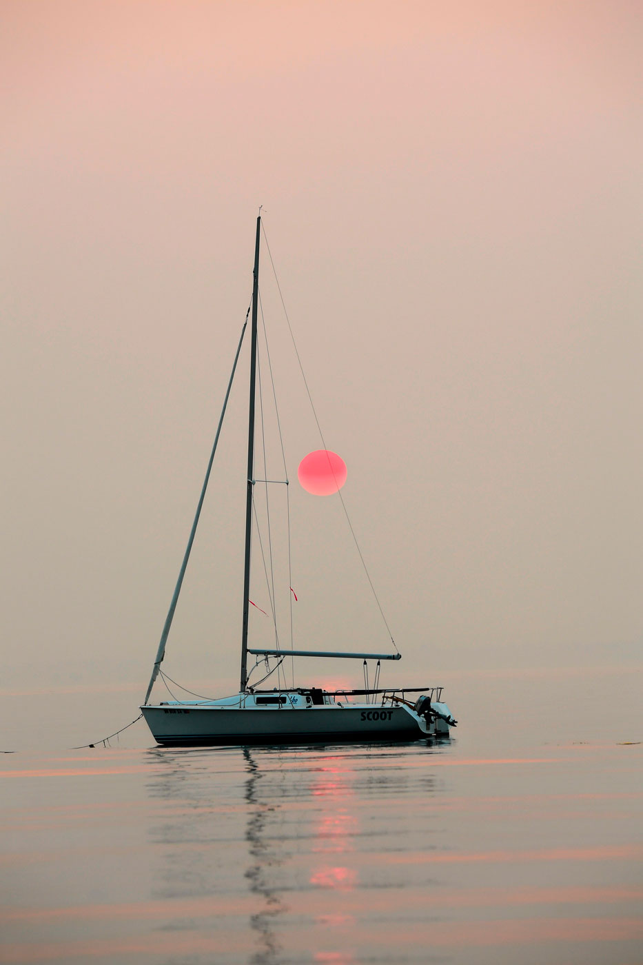
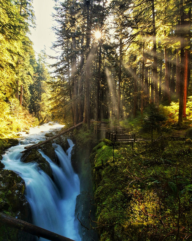
British Columbia and California had record-setting seasons for fires in 2017. In the Puget Sound region, the fires brought smoke so thick it blocked out the sun.
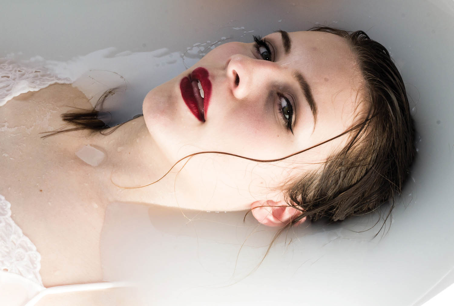
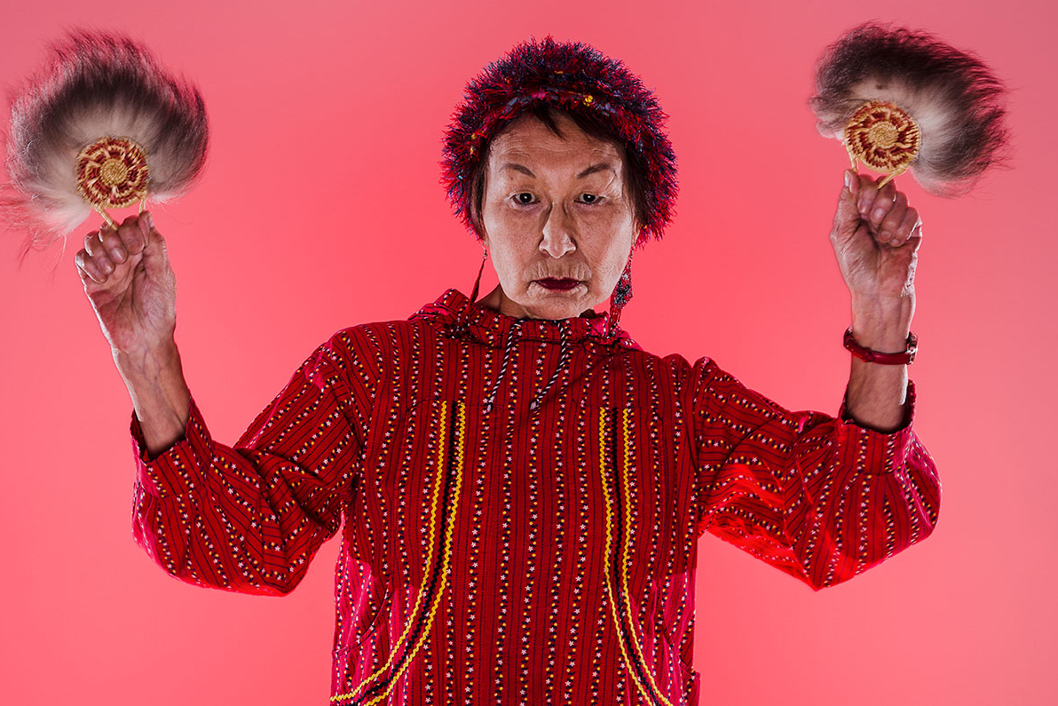
I find myself making better images when I decide the day of, or don’t do much planning. This self portrait was one of those. There’s not much meaning behind it at all. I think making spontaneous art can be important and helpful to the artistic process.
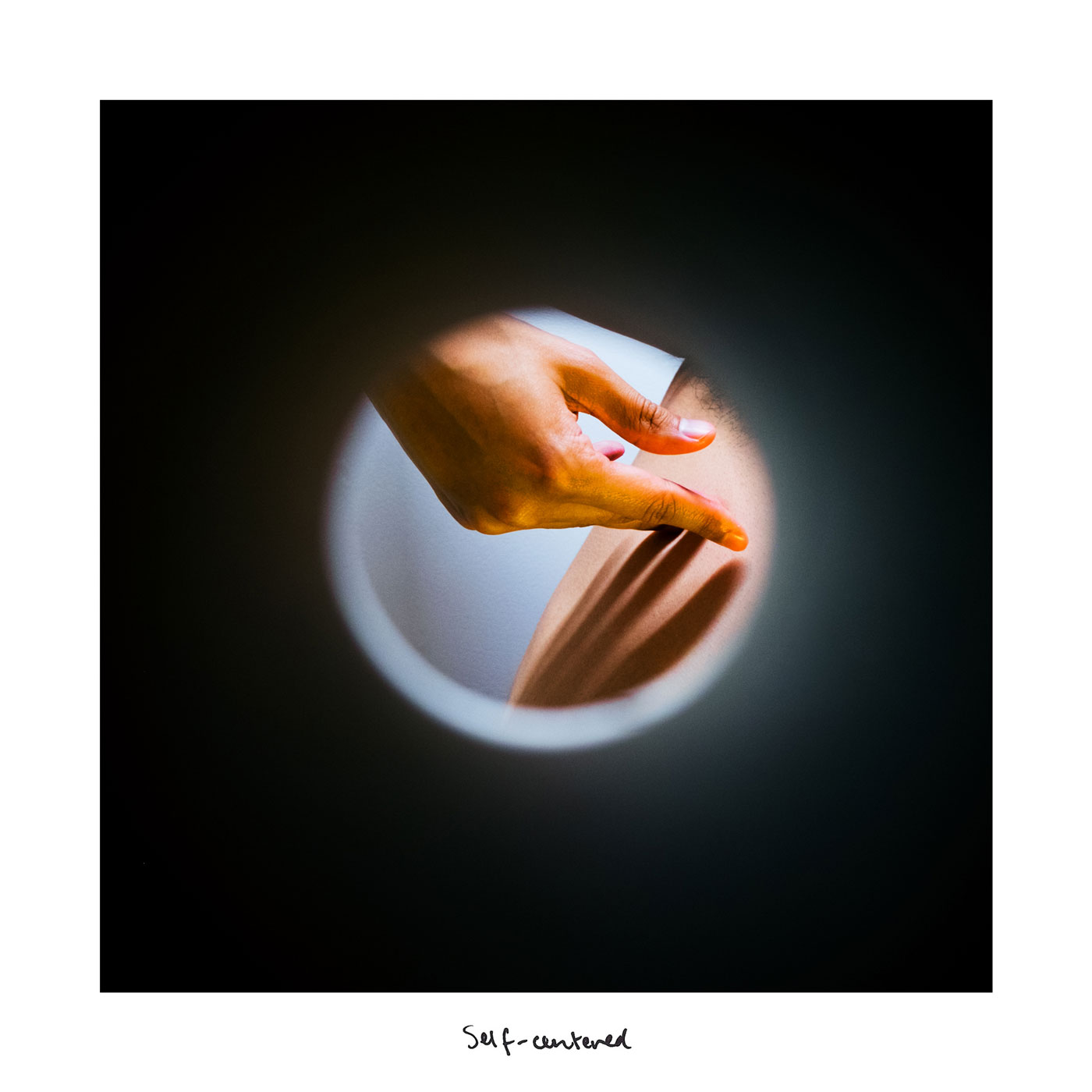
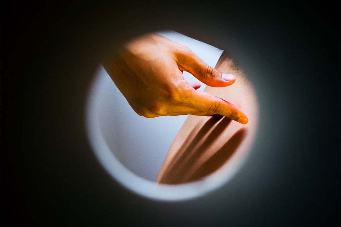
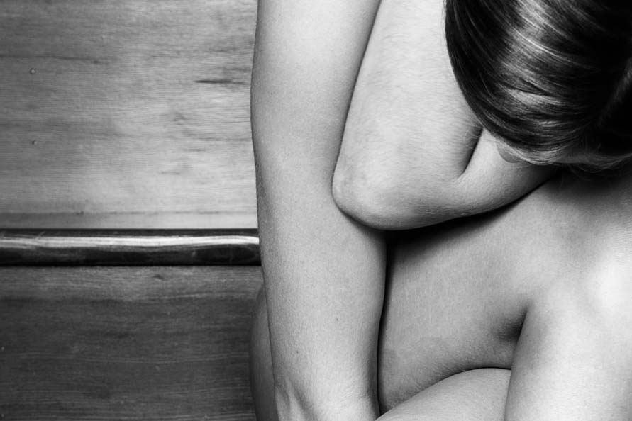
This is the place that I live in. It holds all of the memories that make me who I am. In this place I am constantly changing, mentally and physically. The tiny hole forces the viewer to look at something delicate and beautiful but at the same time, it feels like you aren’t supposed to be looking at all. I made this image through a roll of toilet paper attached to my lens. I don’t have a personal connection to TP but I loved how the final images came out.
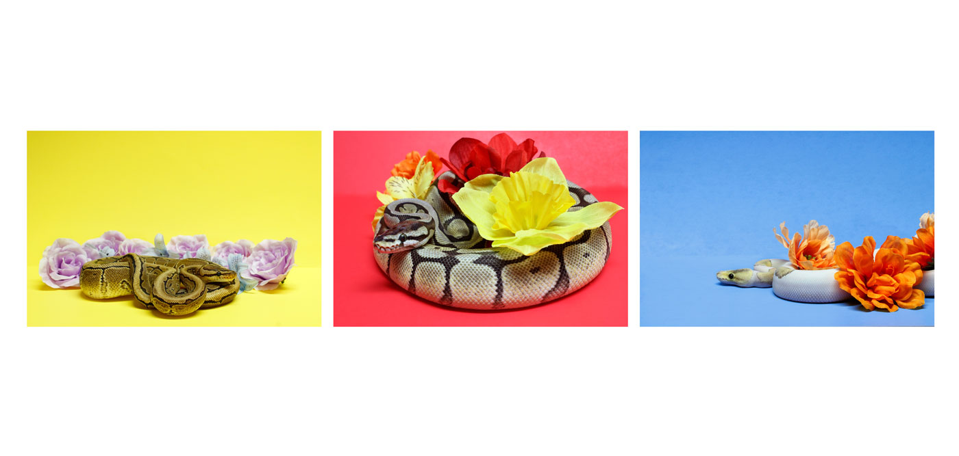
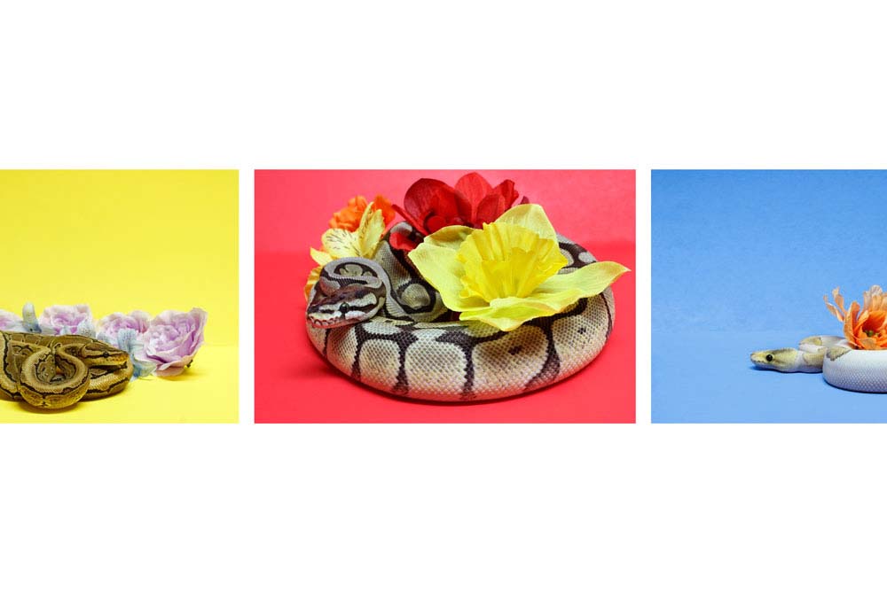
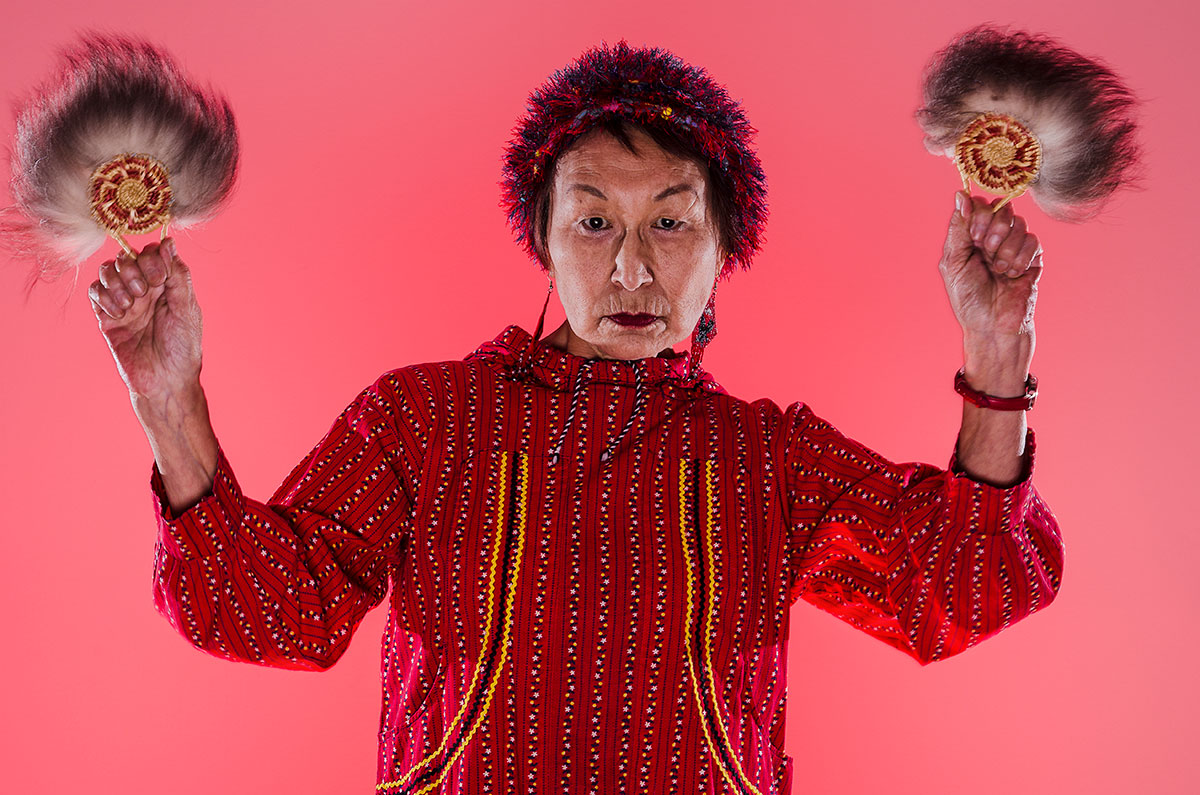
Snakes in a new perspective. Something you would not expect. What? Were you expecting something scary?

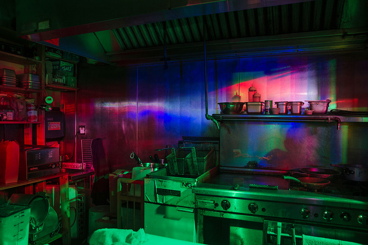
A friend and I took a road trip out of the blue, and ended up going cliff jumping. I had never been to the place, but it was a perfect place for photographs. I didn’t intend to make such a dark looking photograph, but it was the best one of the day!

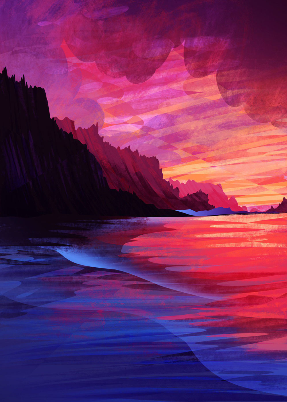
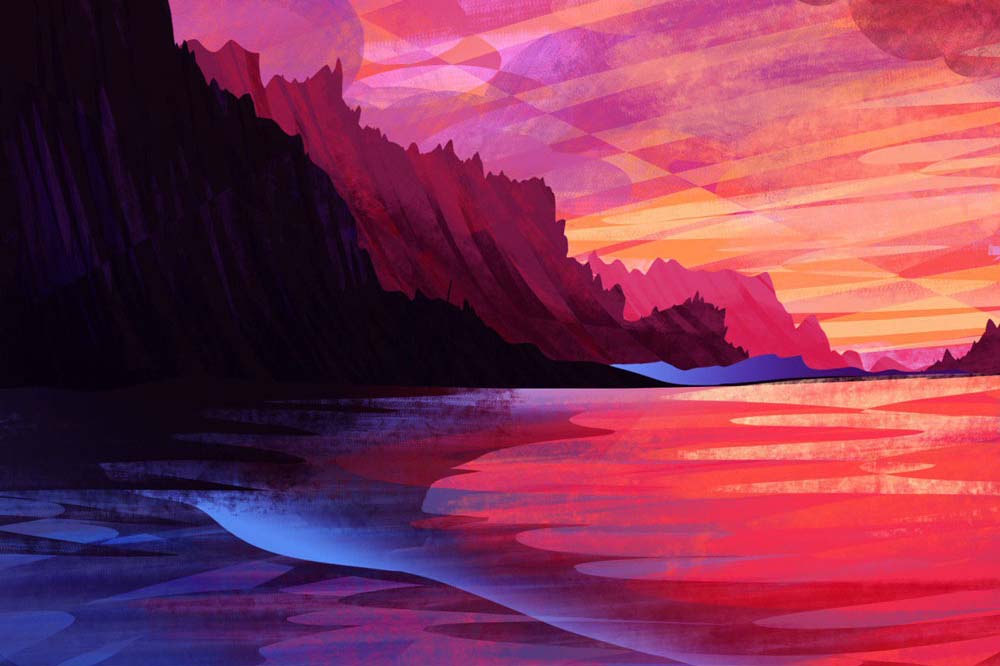
Whenever I feel stressed or anxious I like to draw sunrises and sunsets over water. I spent a lot of time on Whidbey Island growing up and when I draw those familiar surroundings it feels very comforting. 255957_
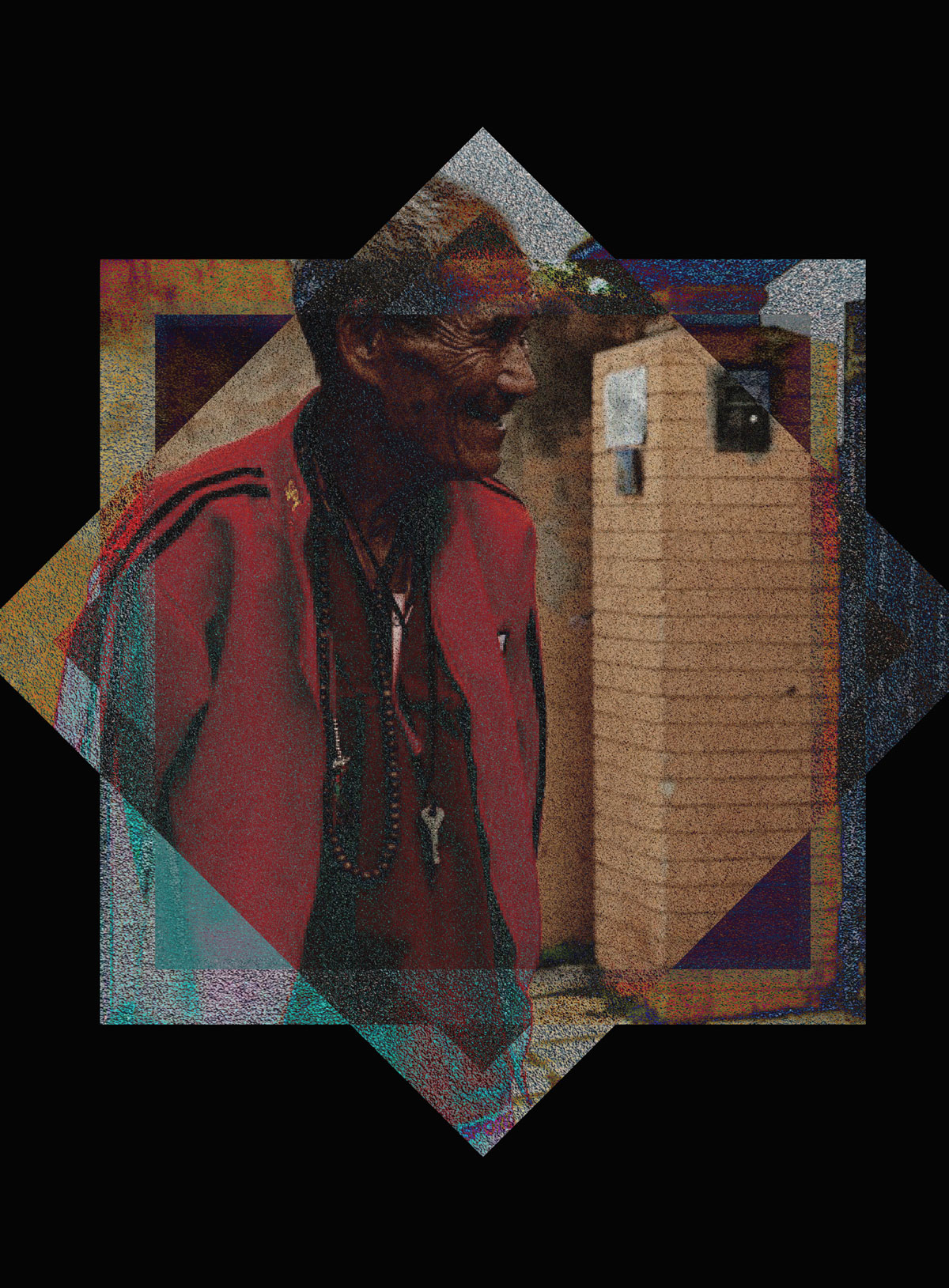
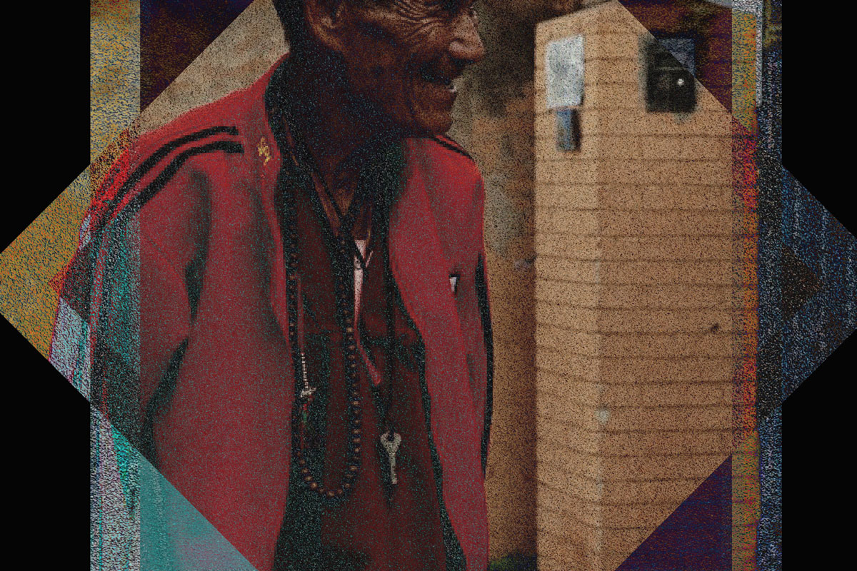
I created this piece using a photograph I took while traveling in Nepal. The wise man was casually walking. I snapped a quick photo of him and obsessed over it. To create this piece, I overlaid the same photo using a different filter. I then brought in shapes to hold the piece in a symmetrically balanced way. 255957_

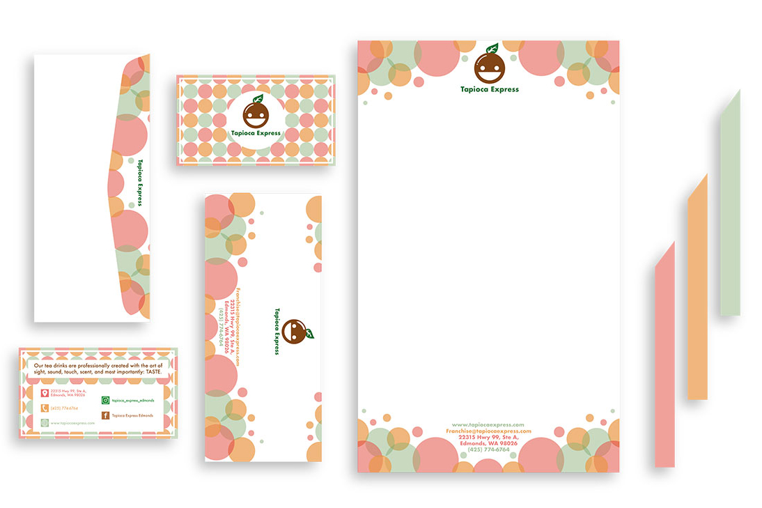
A collection of minimal logos.
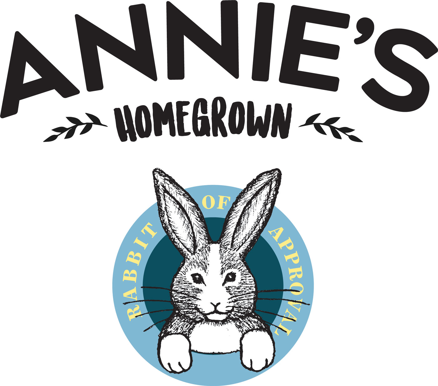
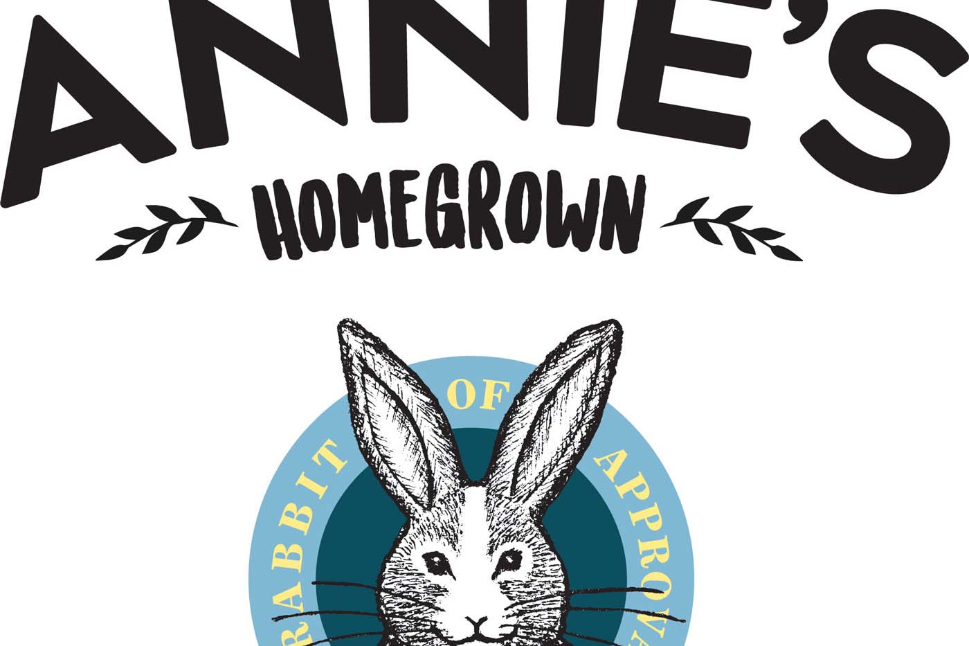
I created this to enhance our revolutionary design of the Annie’s Macaroni and Cheese box.
Inspired by the color theory unit in ART110, I wanted to play with the idea of additive light in my art. It really taught me that it’s not ideal to solely rely on blending modes in digital art programs to do all of your shading, highlights, etc. That doesn’t mean they aren’t useful, but learning how to mix your own colors from scratch helps out bunches.
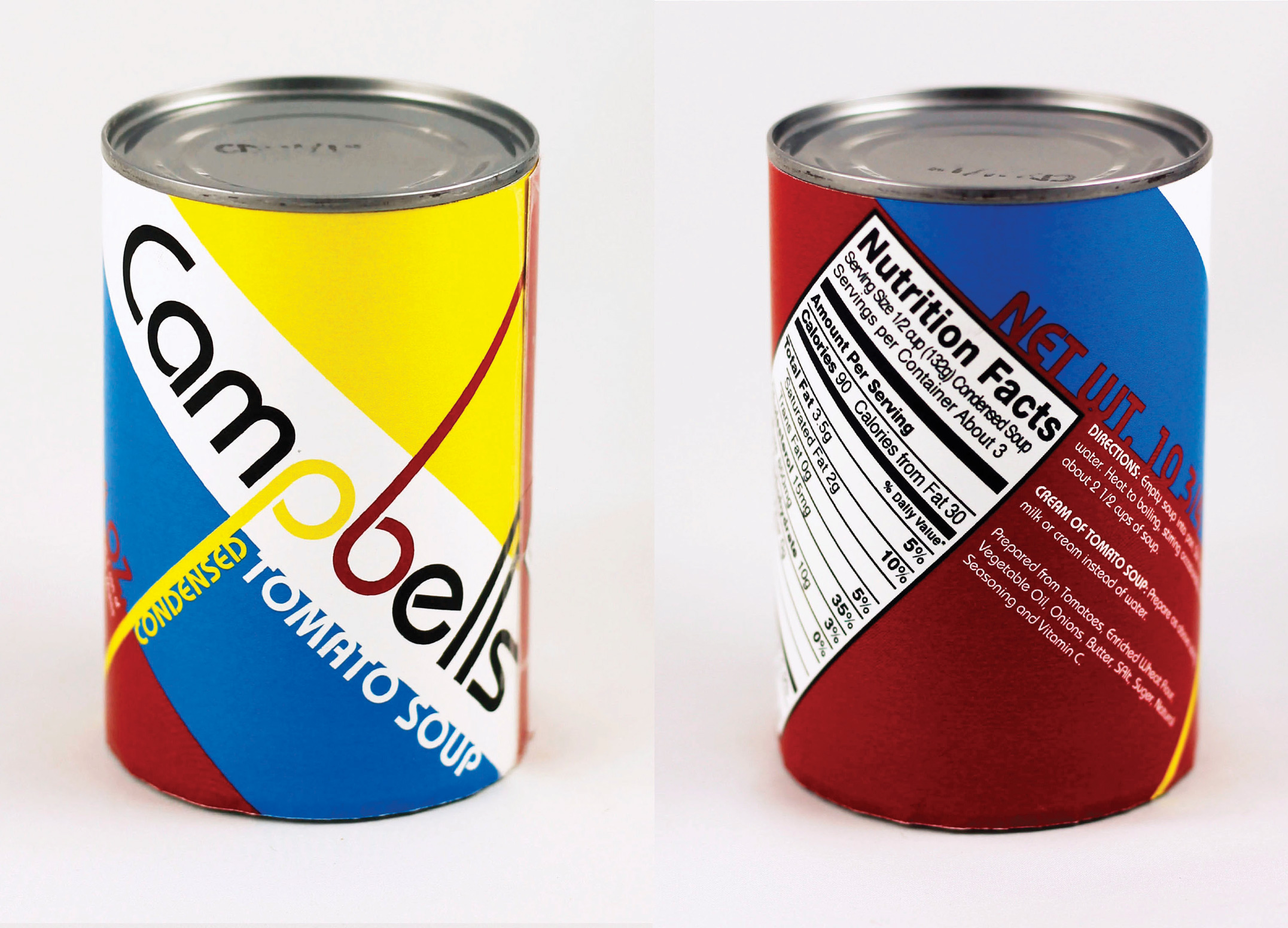
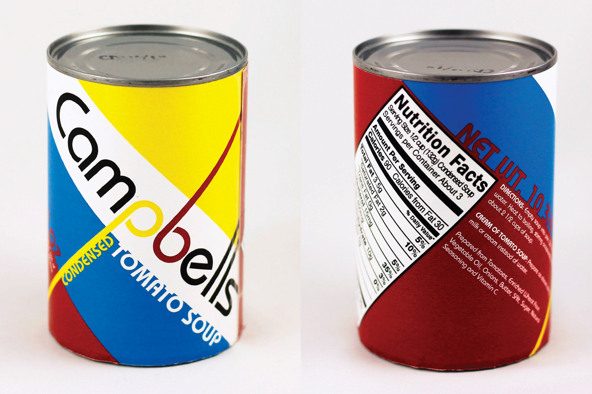
This piece was my final project for Graph 202 - Package Design. It is a redesign of Campbell’s iconic tomato soup label. The design uses primary colors and 45 degree angles to capture the Bauhaus design style.
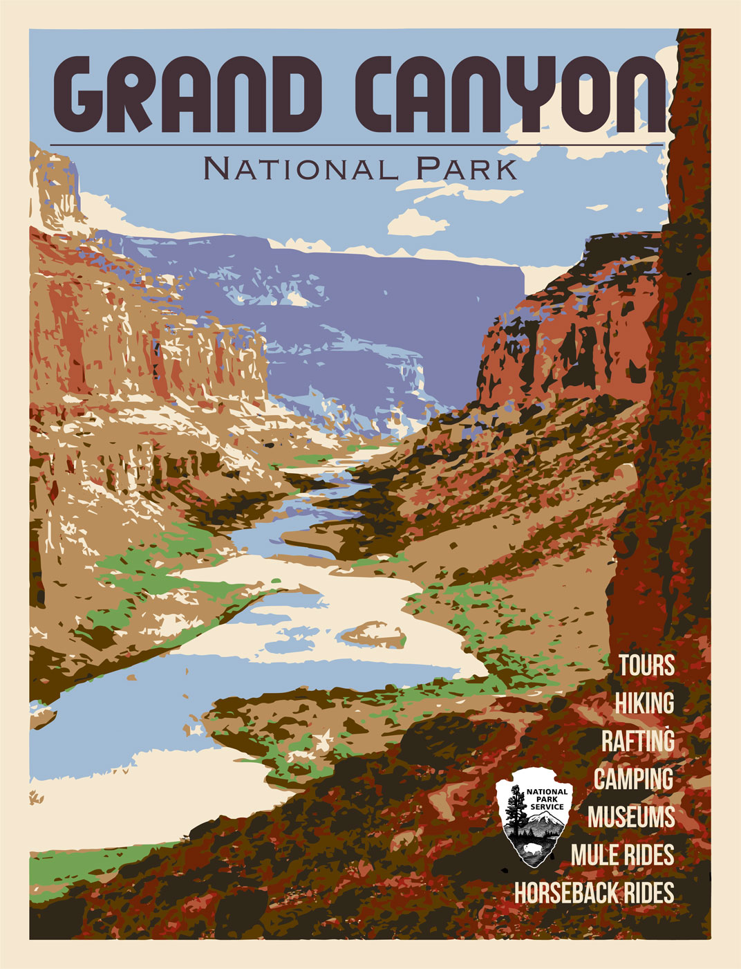
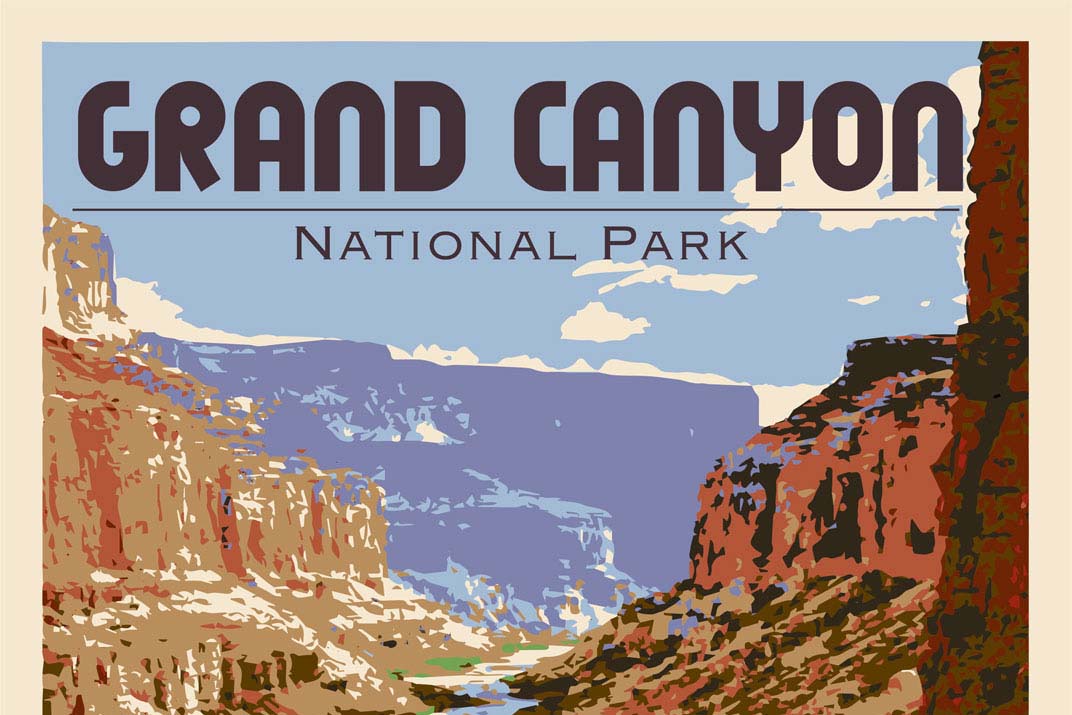
This image replicated a WPA “See America” poster, I used a restricted color pallet to give it a painterly appearance.
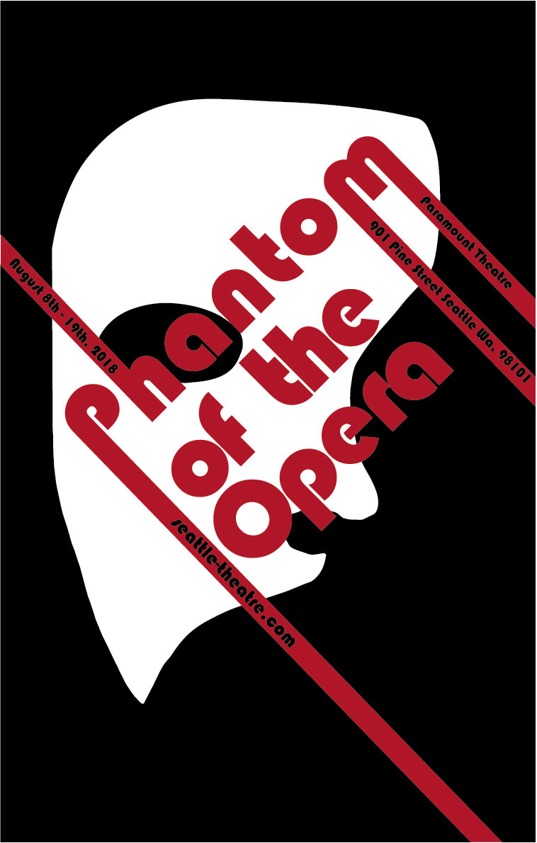
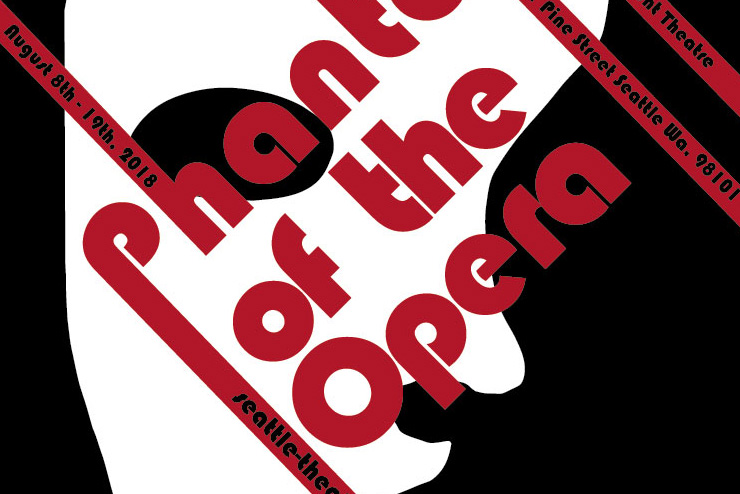
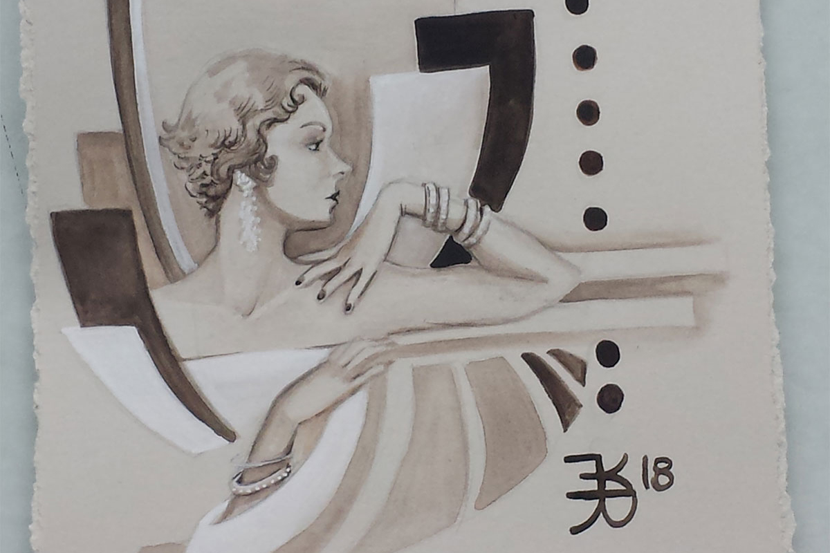
A Bauhaus style poster for the Phantom of the Opera musical.
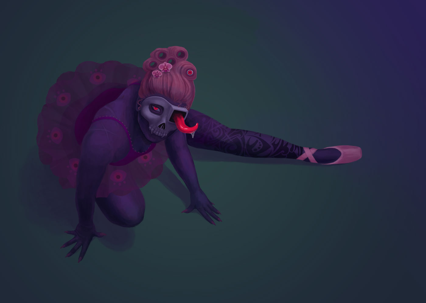
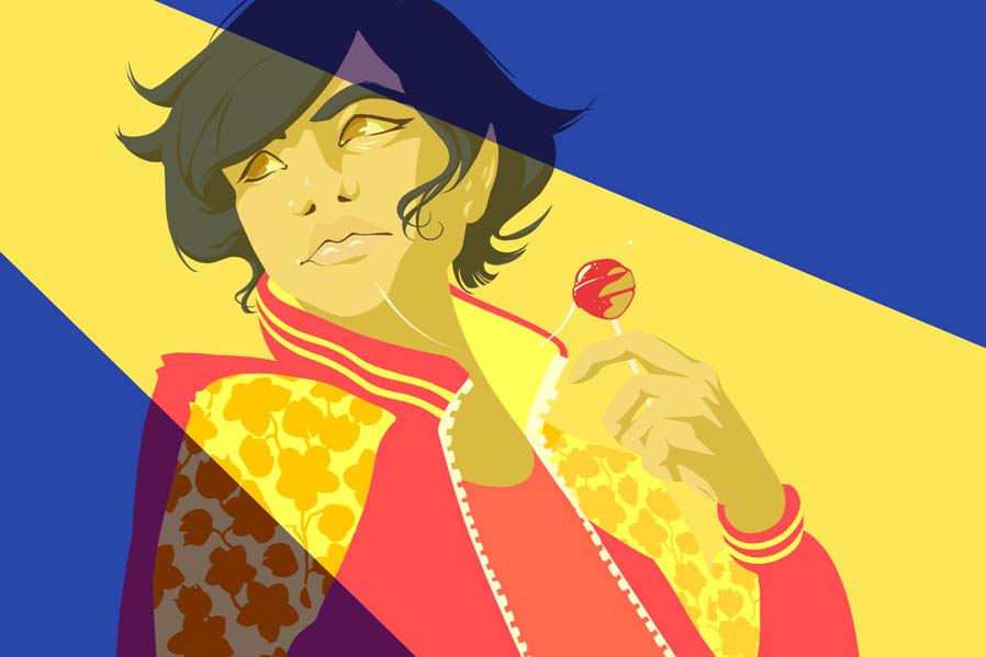
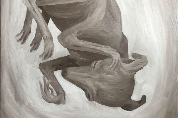
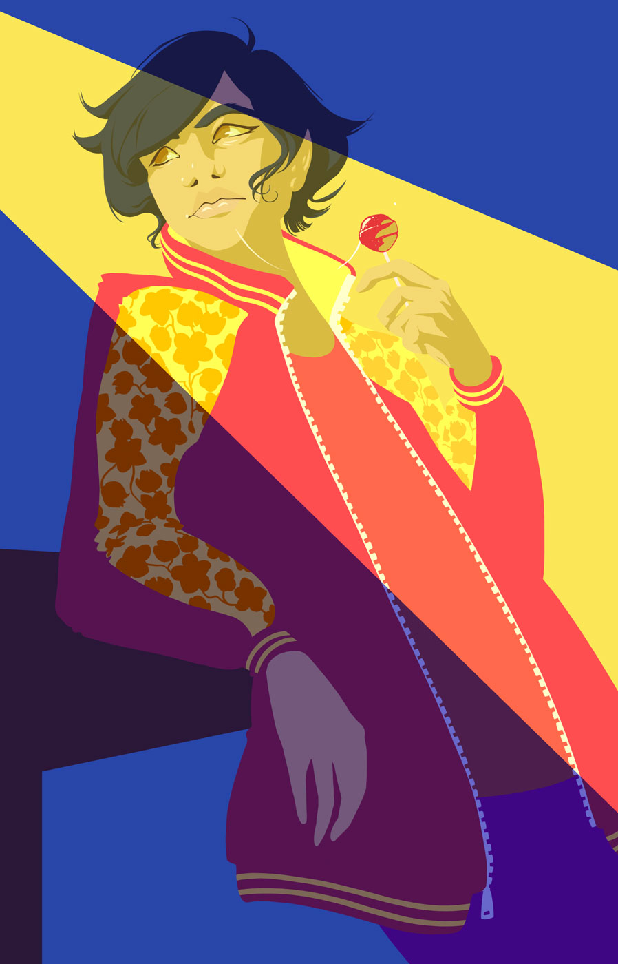
Creating this piece was a rough process, and definitely gave me some trouble. This illustration started out as an exercise in drawing more dynamic poses. By the time I realized I wanted to make it into a piece of it’s own, I was far past the planning stages. That made creating a thematic piece difficult. In the end, it turned out rather nicely and I look at this project as a learning experience.
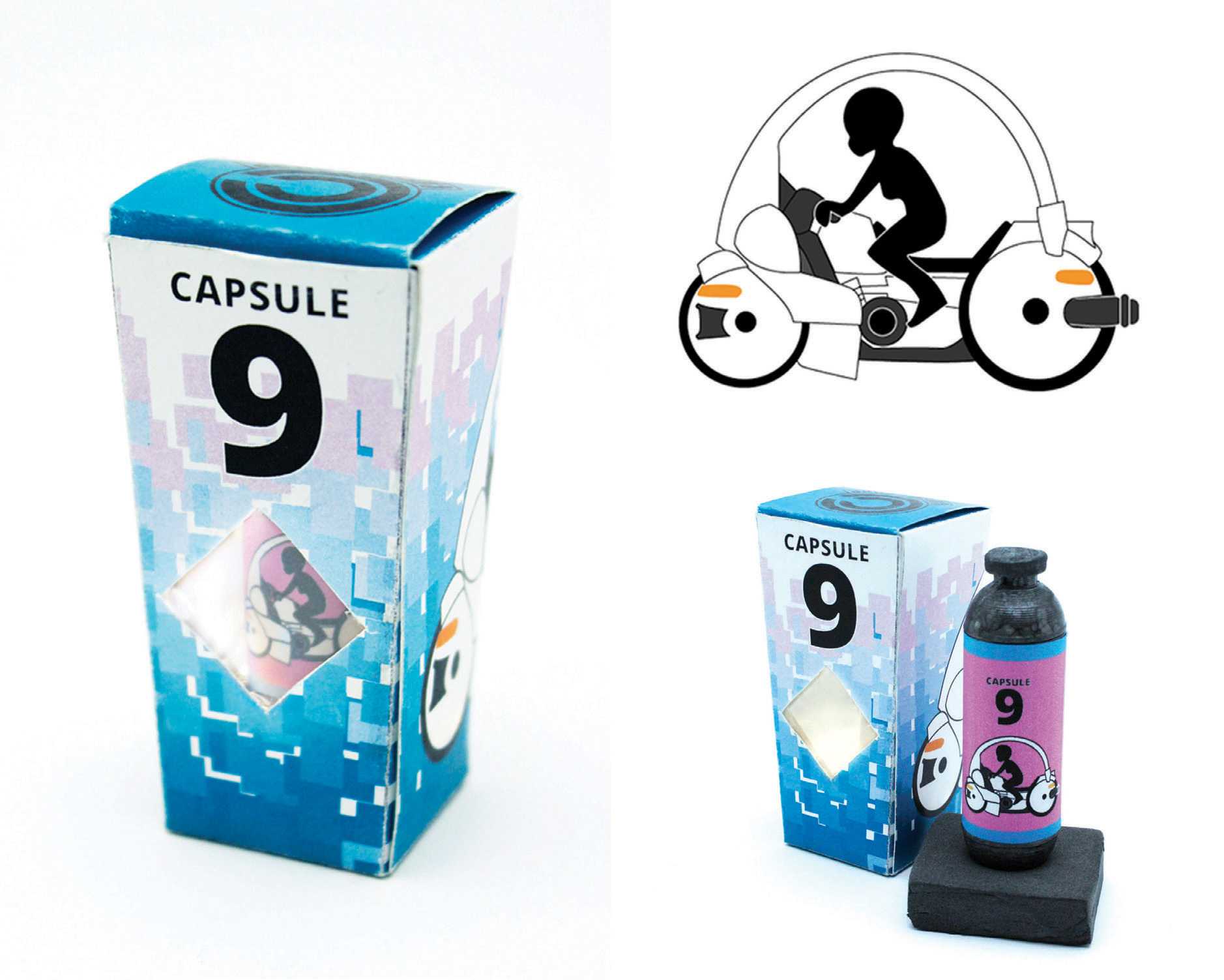
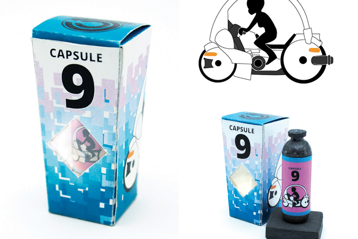
A single use capsule, from Capsule Corp. This package design final was created simply so I could 3D print a Capsule from Capsule corp and create a package for it. (This product is fictional and from a beloved anime Dragon Ball Z). The final product is less than 4 inches tall and retail value would be (theoretically) from $2,000 and up depending on the products contents. The final package is simple, minimal text and features a vector image of what this capsule contains. In this No. 9 capsule there is a motorbike. Simply press the plunger and toss a distance of 15 feet away for safety, and wait for the magic to happen.
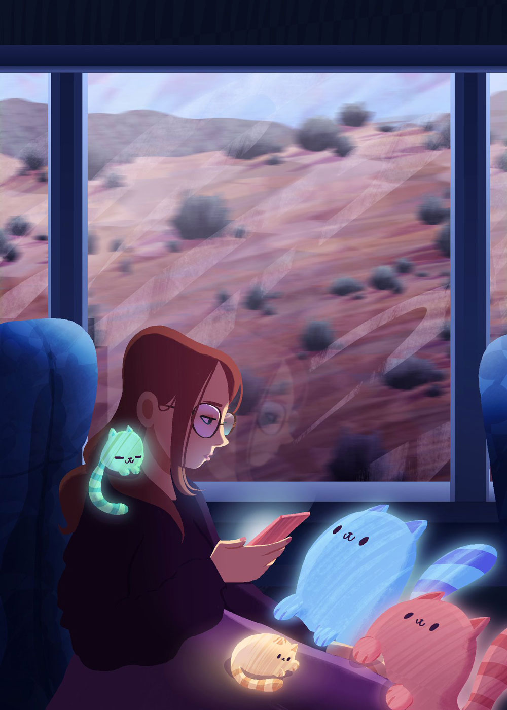
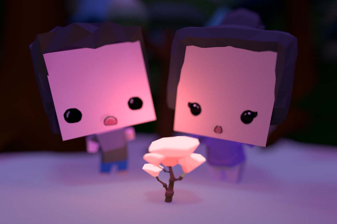
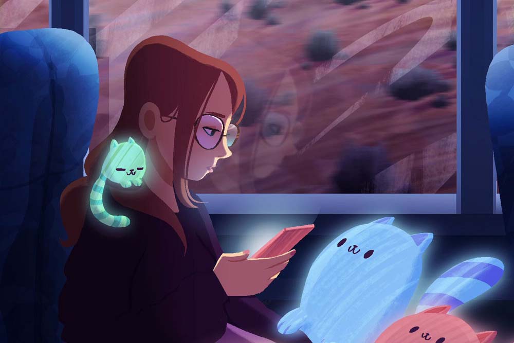
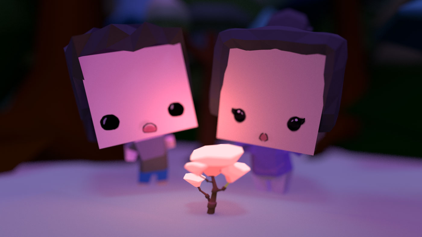
Back in the fall, I went on a work trip that had a really long bus ride involved. Sometimes when I’m zoning out on a car trip and the surrounding cacti are starting to blend together, I like to imagine little creatures and things outside. This piece is based on that car-boredom.
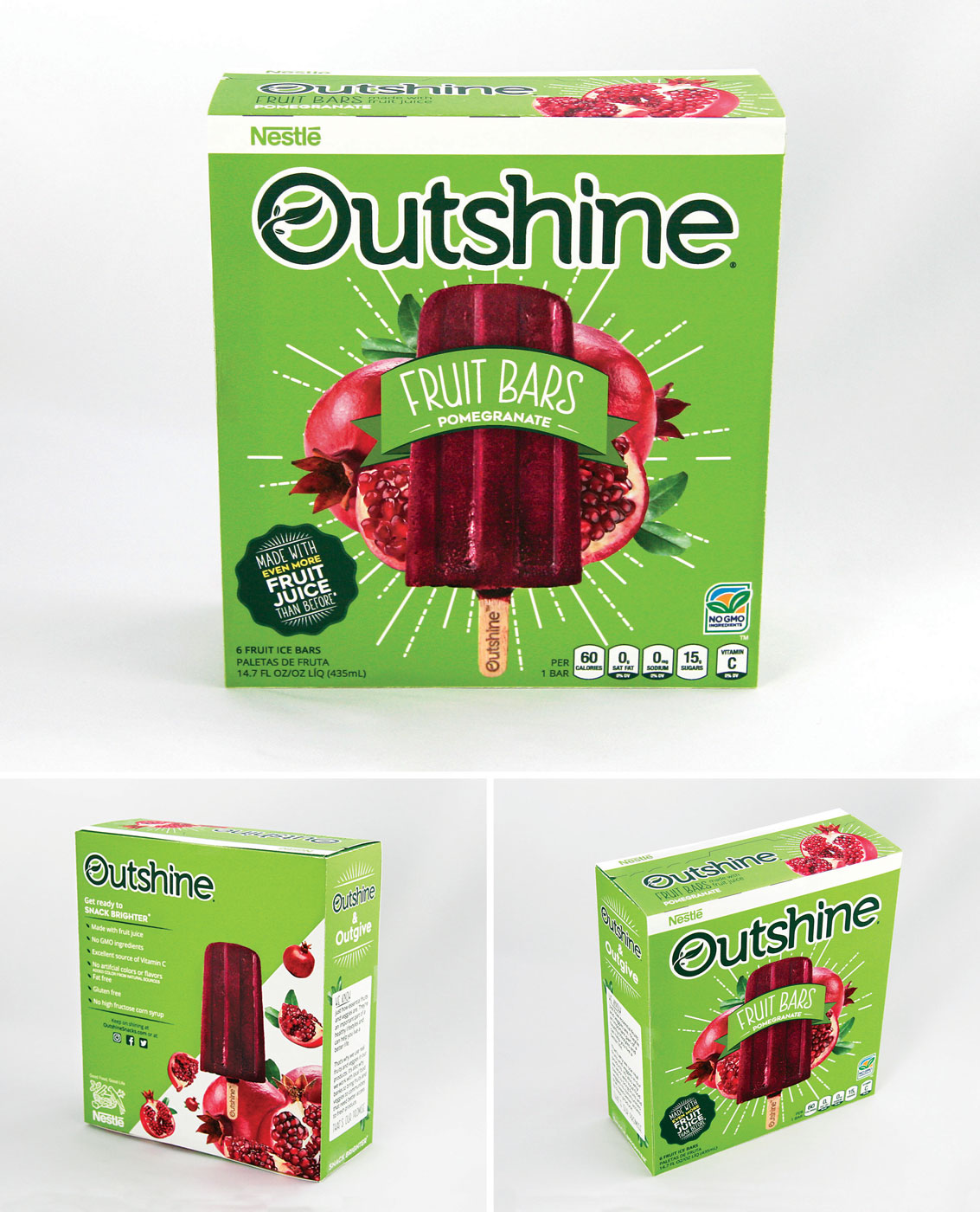
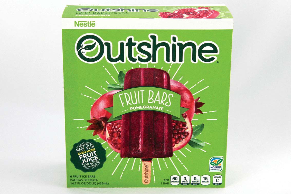
I took an existing package of Outshine Fruit Bars and created a whole new and cleaner look. My goals were to flatten the overall design and to convey the message of freshness and fun.
The image speaks for itself.
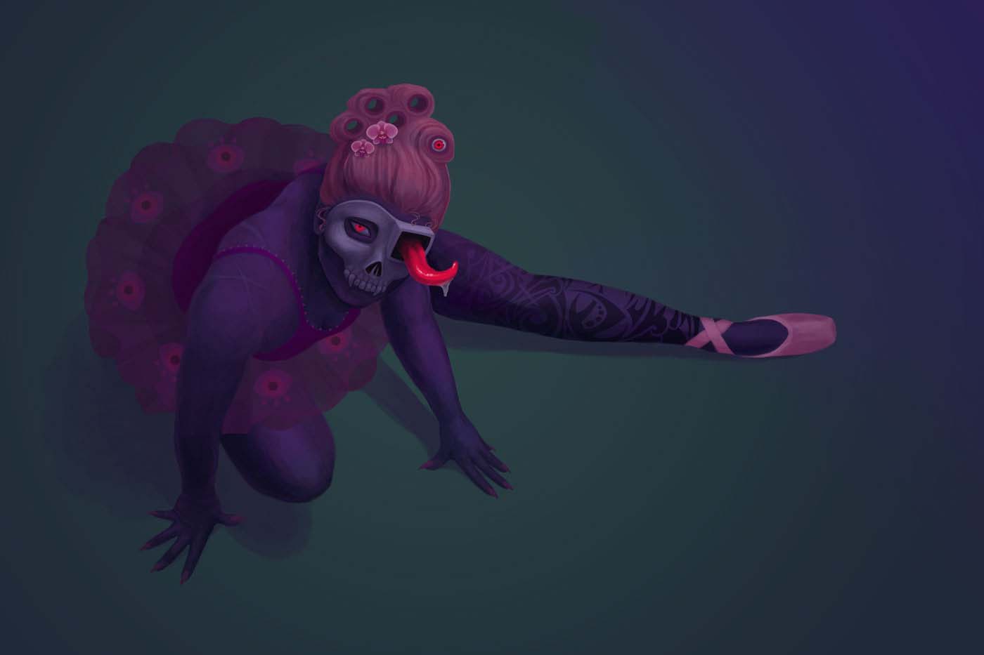
Delilah is a sweet and lively girl, which may surprise some people considering that her father is the Grim himself.
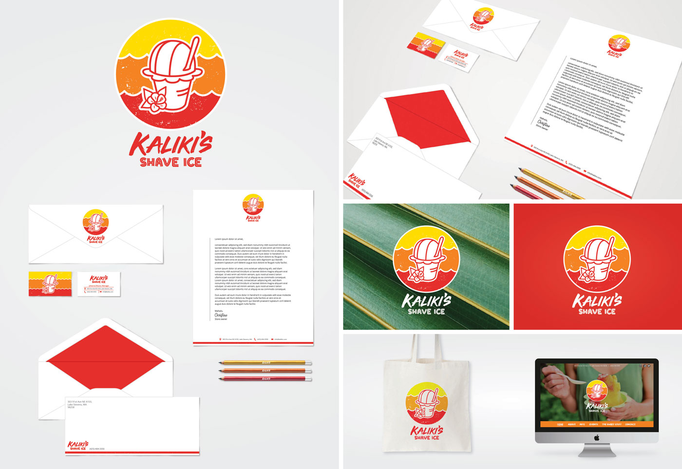
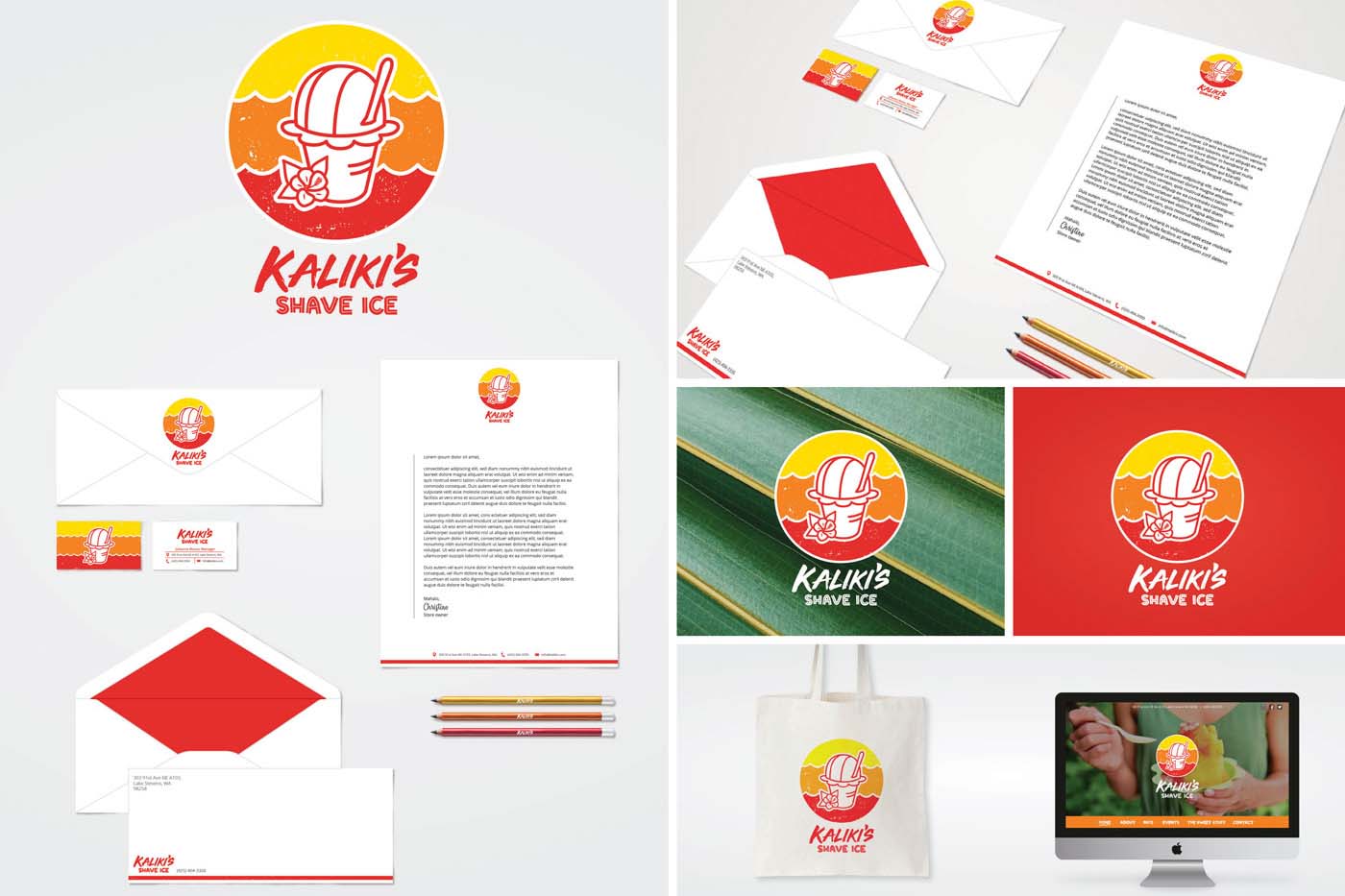
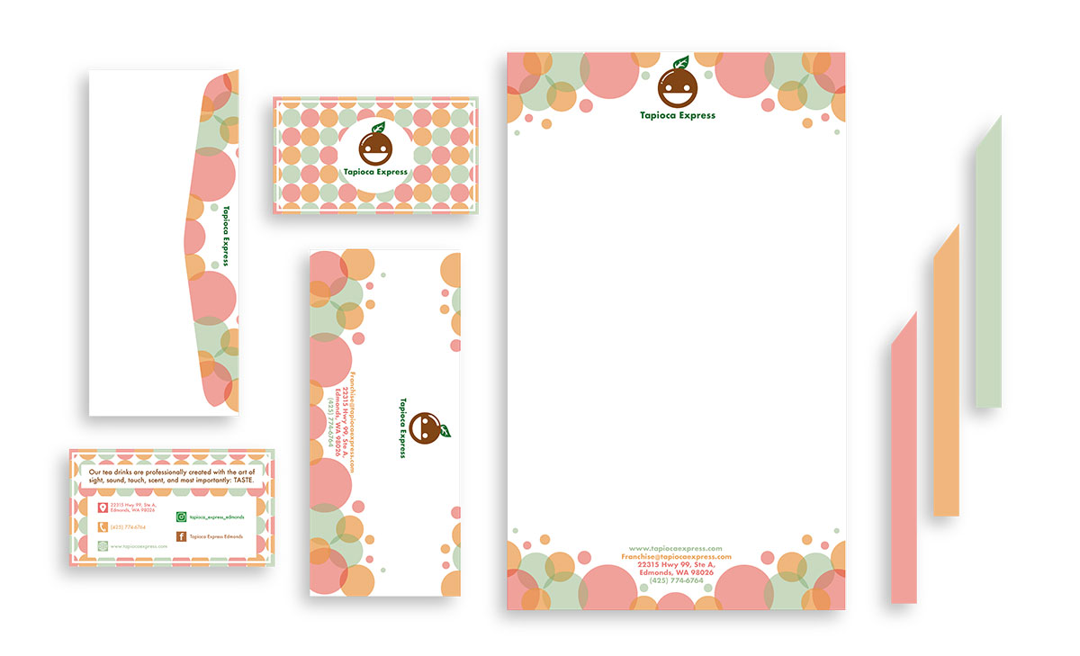
Kaliki’s Shave Ice is a local business located in Lake Stevens, WA. My logo is inspired from the birds eye view of a cone of shaved ice, a sunset, and waves of a beach. The goal of the new brand identity was to portray warmth, passion, and enjoyment.
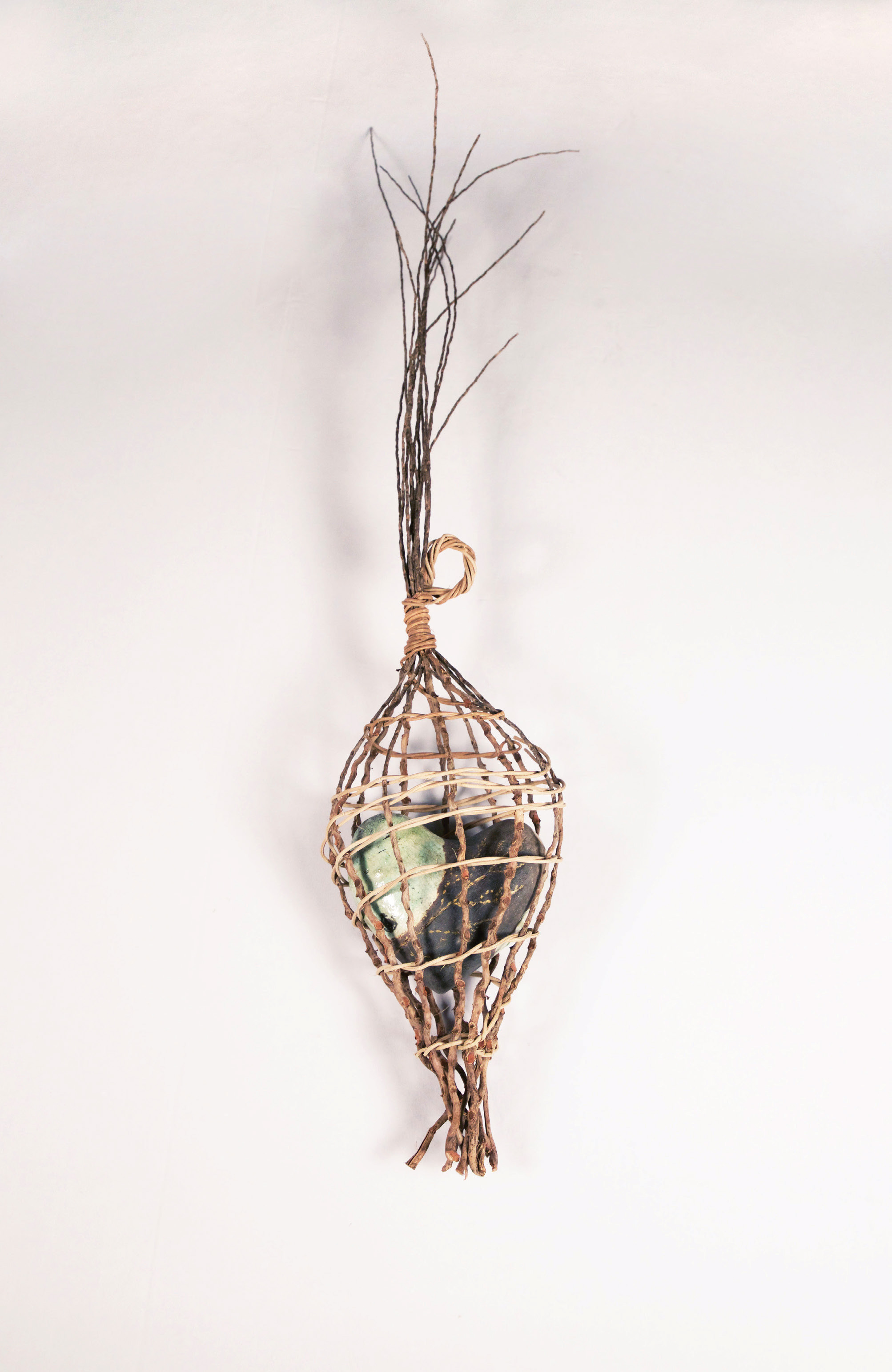
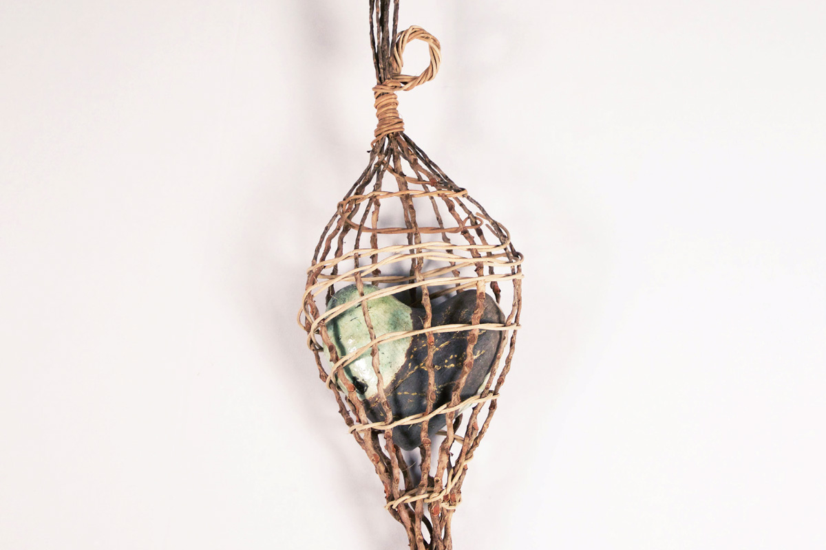
Raku fired ceramic heart encased in a palm and reed woven form. Rattled was created in memory of the students who lost their lives in the shooting at Marysville- Pilchuck High School and the lasting impact gun violence has had on our community.
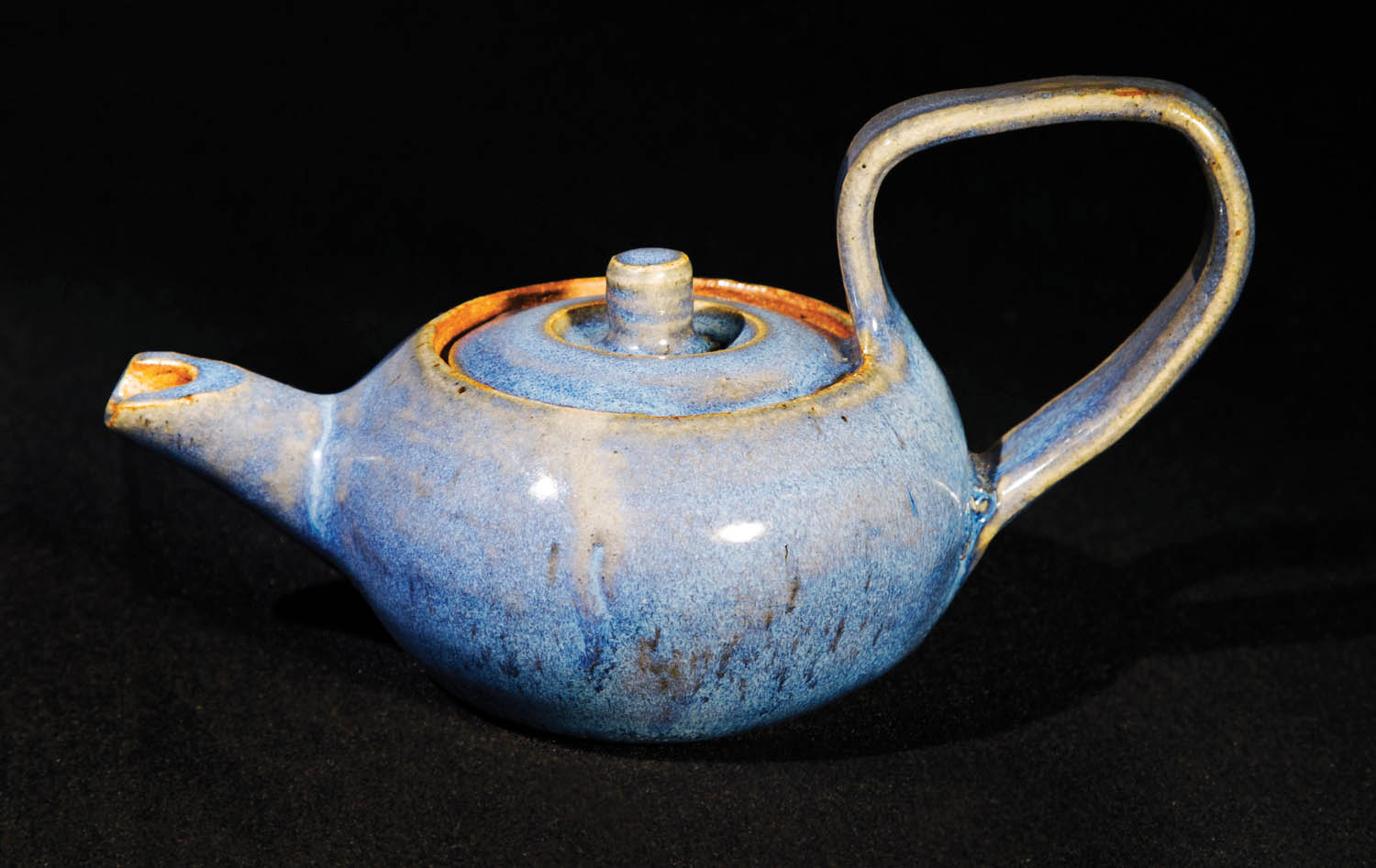
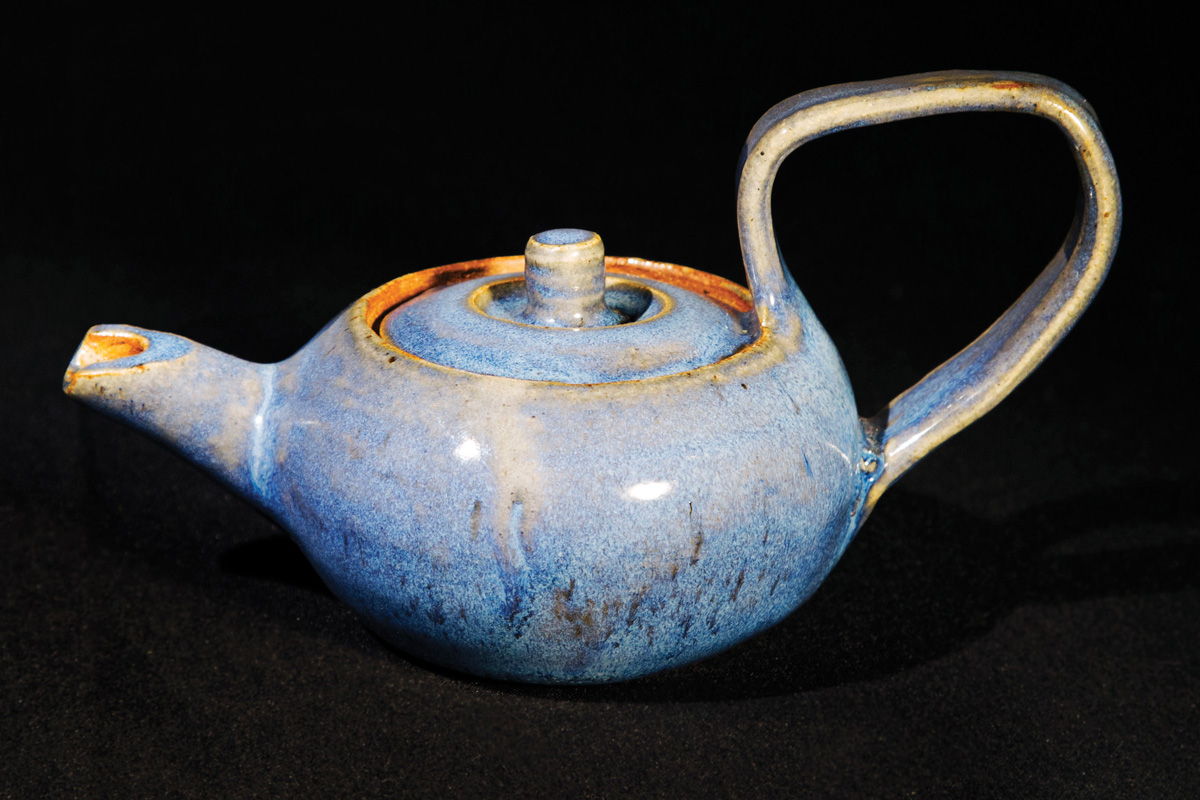
A teapot.
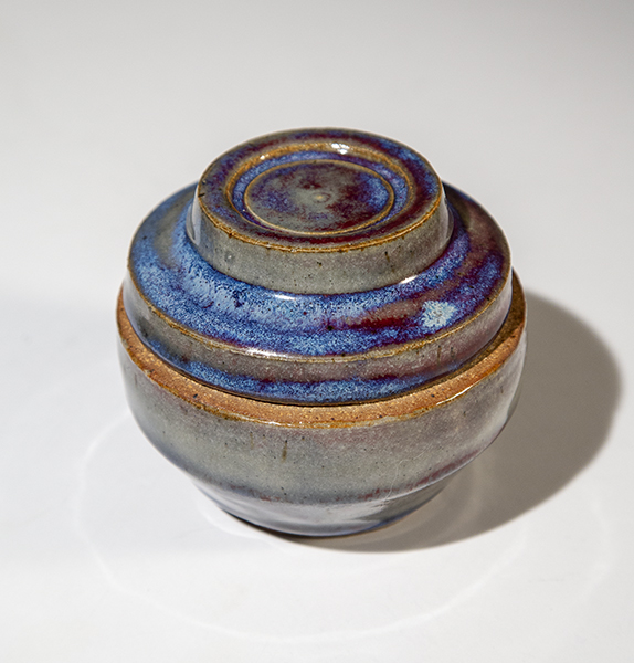
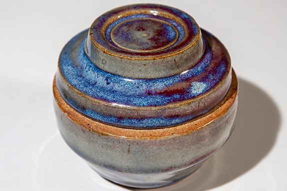
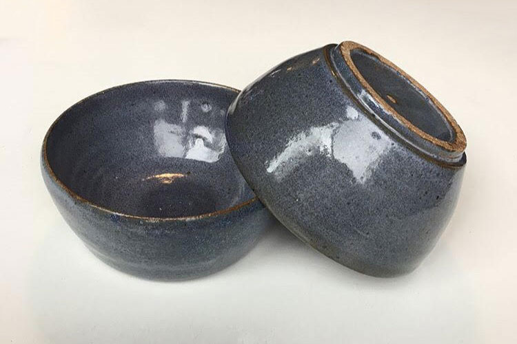
This is one of the vessels I created for class.
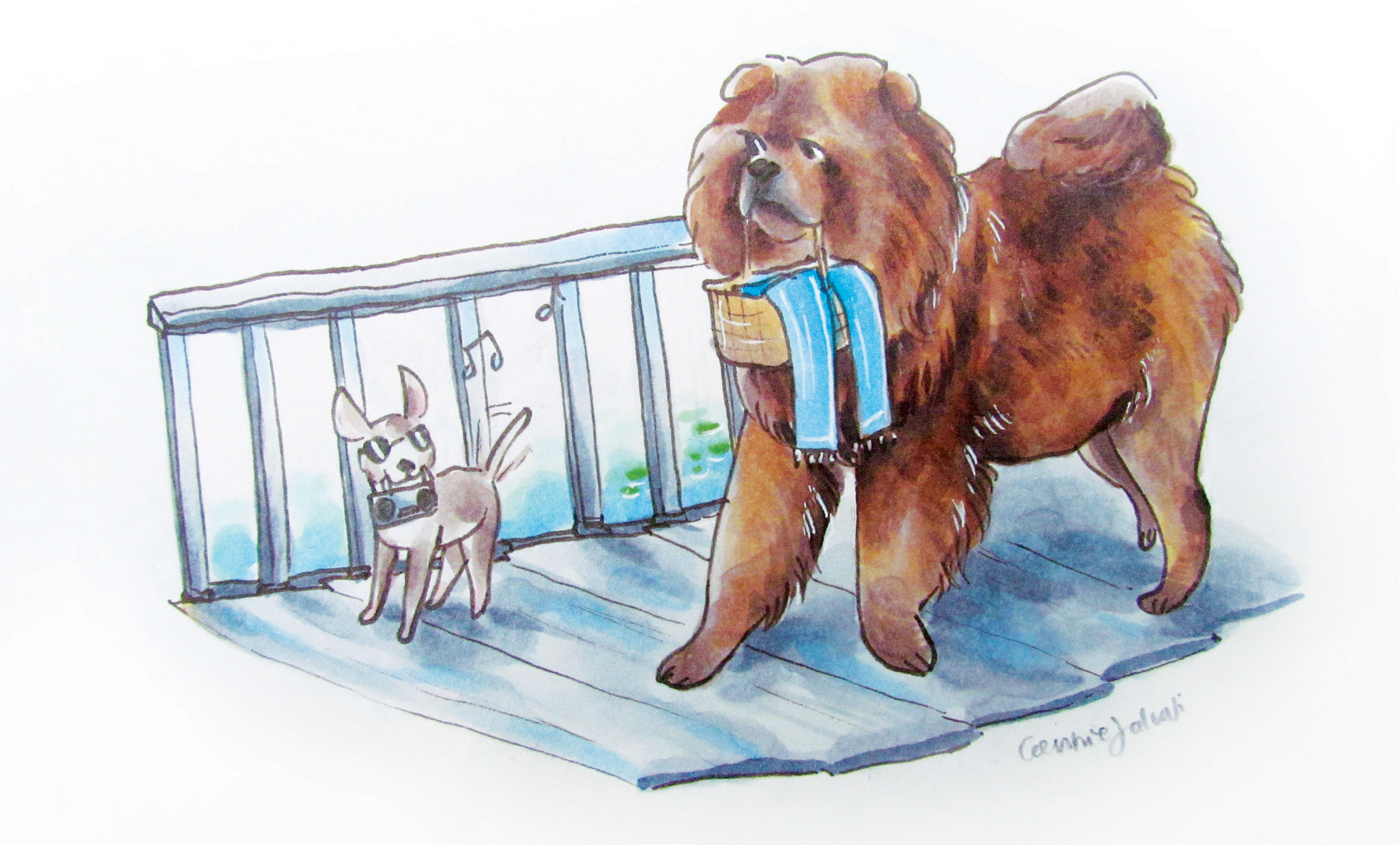
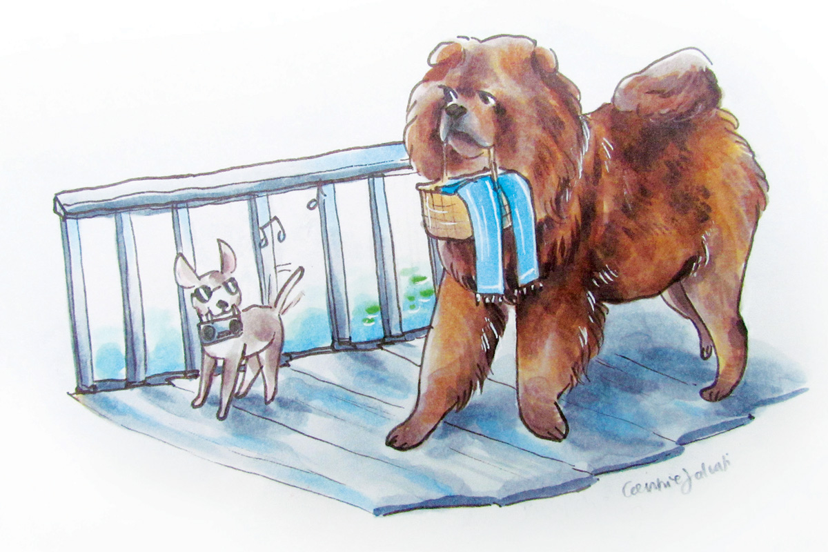
For this particular piece, I used Copic markers on Strathmore sketch paper. The dimensions of this piece are 5-1/2 inches in length and 4 inches in height. I was inspired by the season of summer when I made this illustration. I thought that two dog characters heading down towards a beach to cool off on a hot summer’s day would be a cute concept to illustrate.
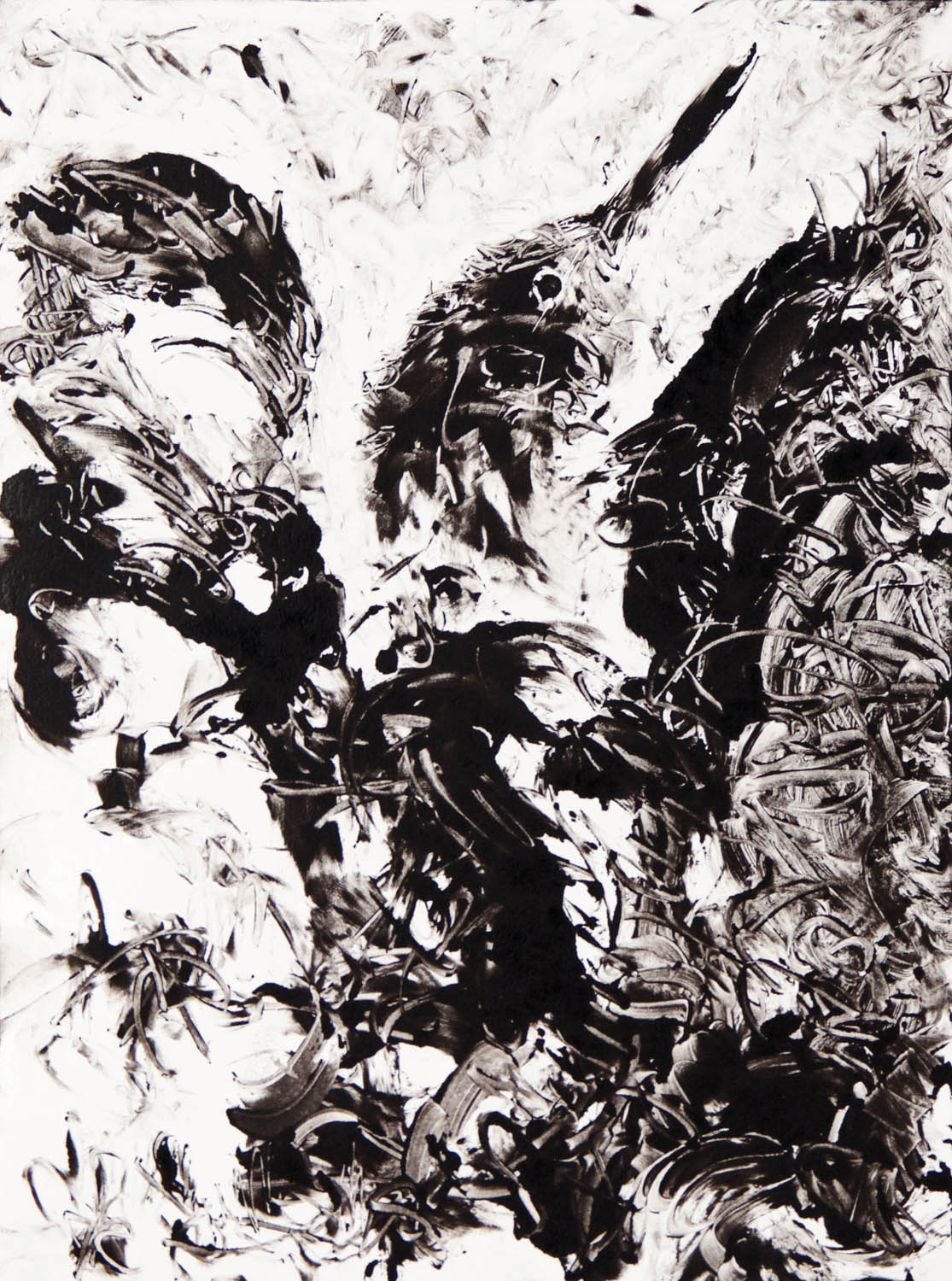
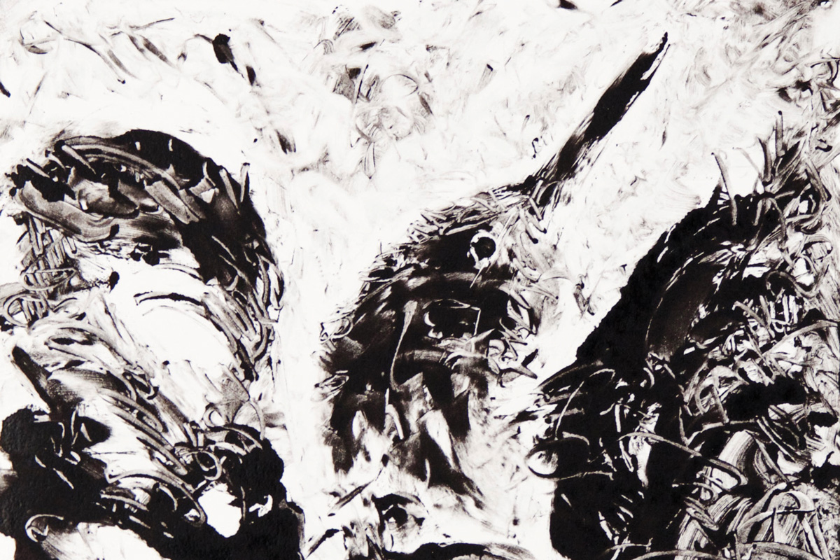
Monoprint. Ink on Stonehedge Paper.
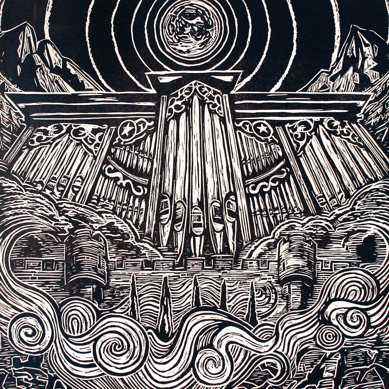
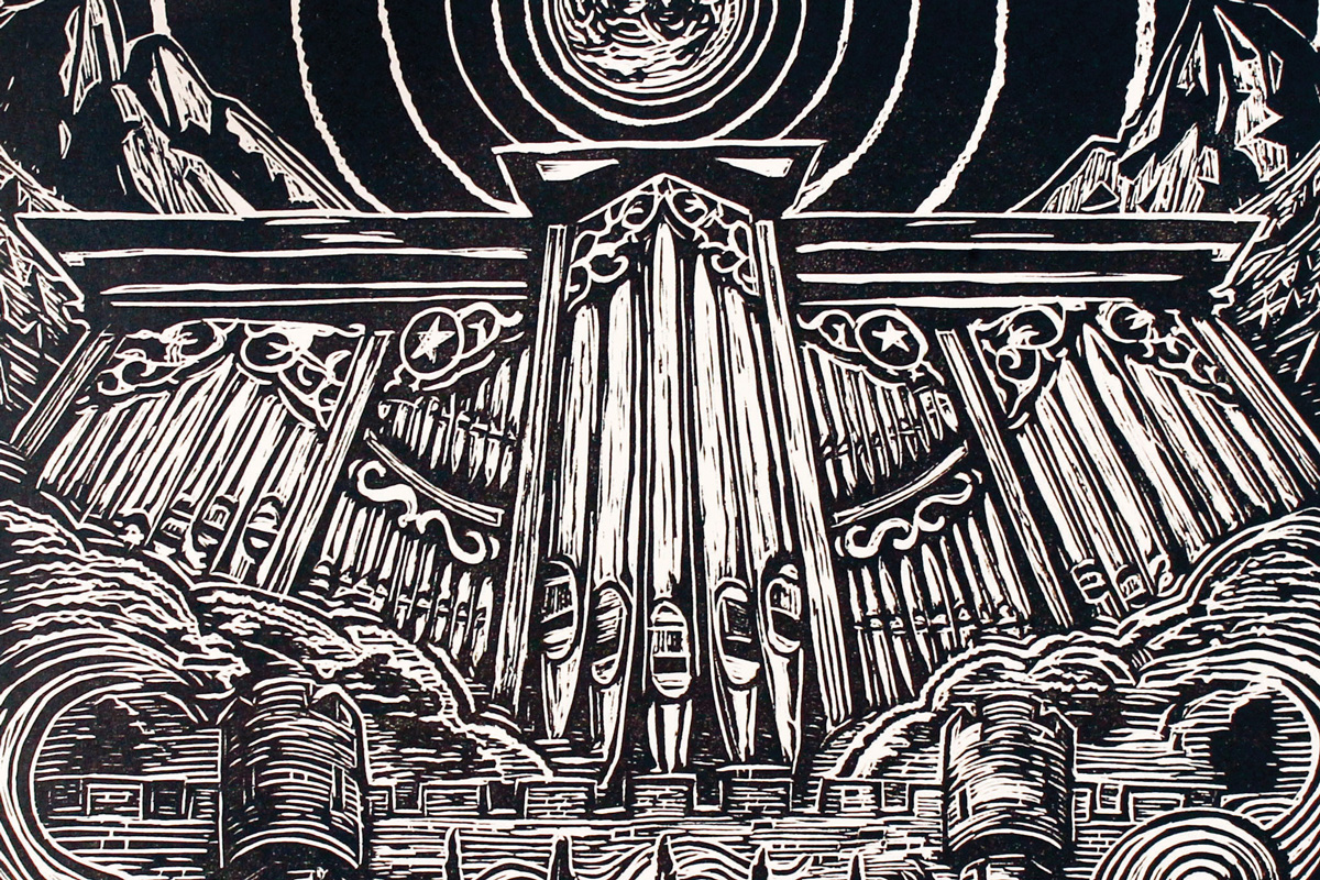
Castle Walls is named after the song name from the 1977 Styx album (The Grand Illusion). I was inspired by medieval woodcuts, and the computer vector graphics that dominated indie pop and electronic music in the mid-late eighties.
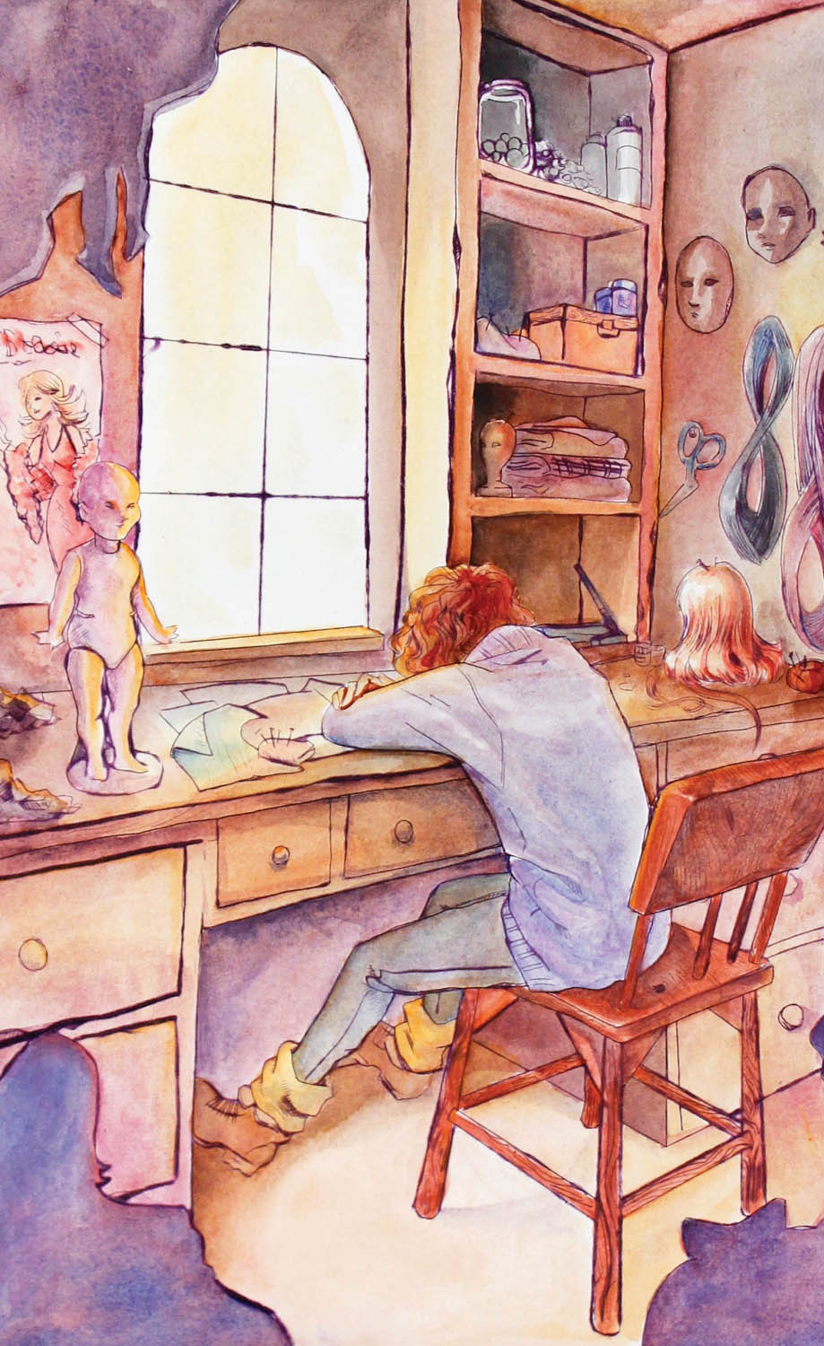
I’ve always had a love of old toys and working with my hands. I hoped to communicate that in this piece. I want to show the passion and commitment of craftspeople and artisans.
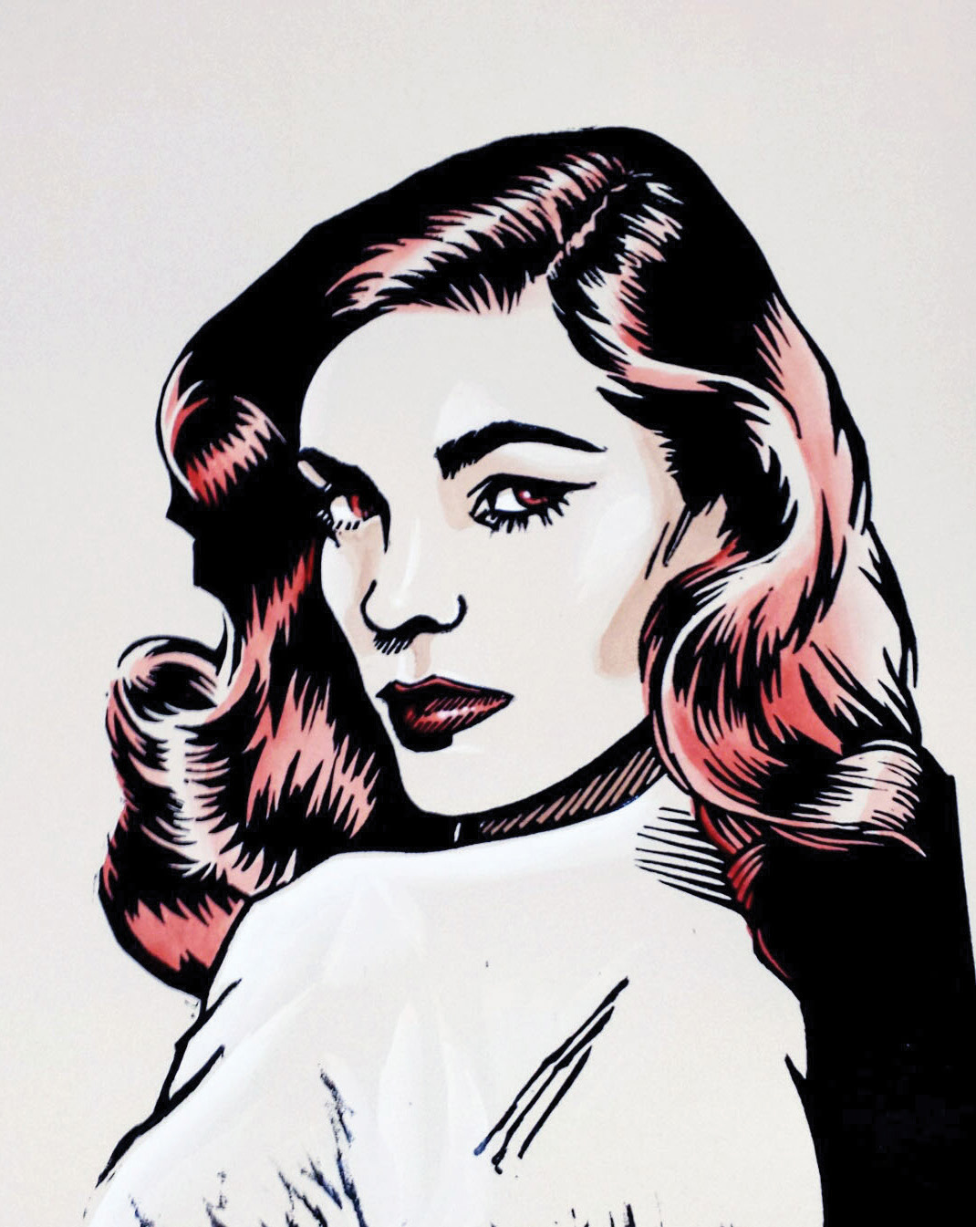
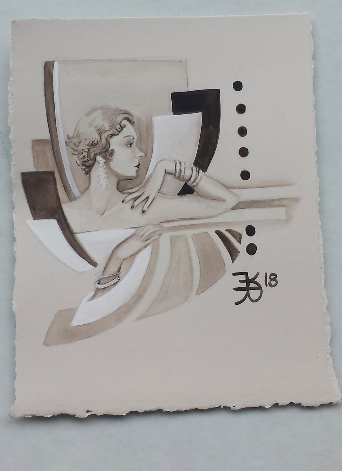
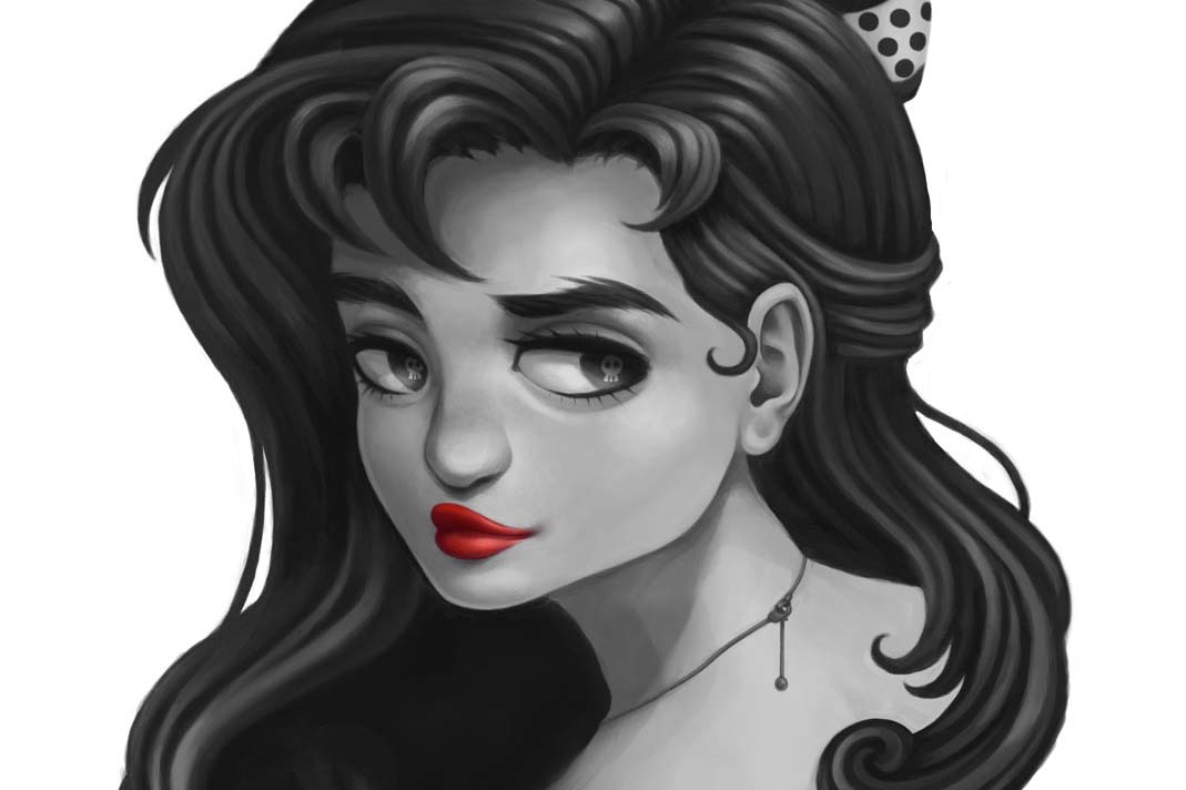
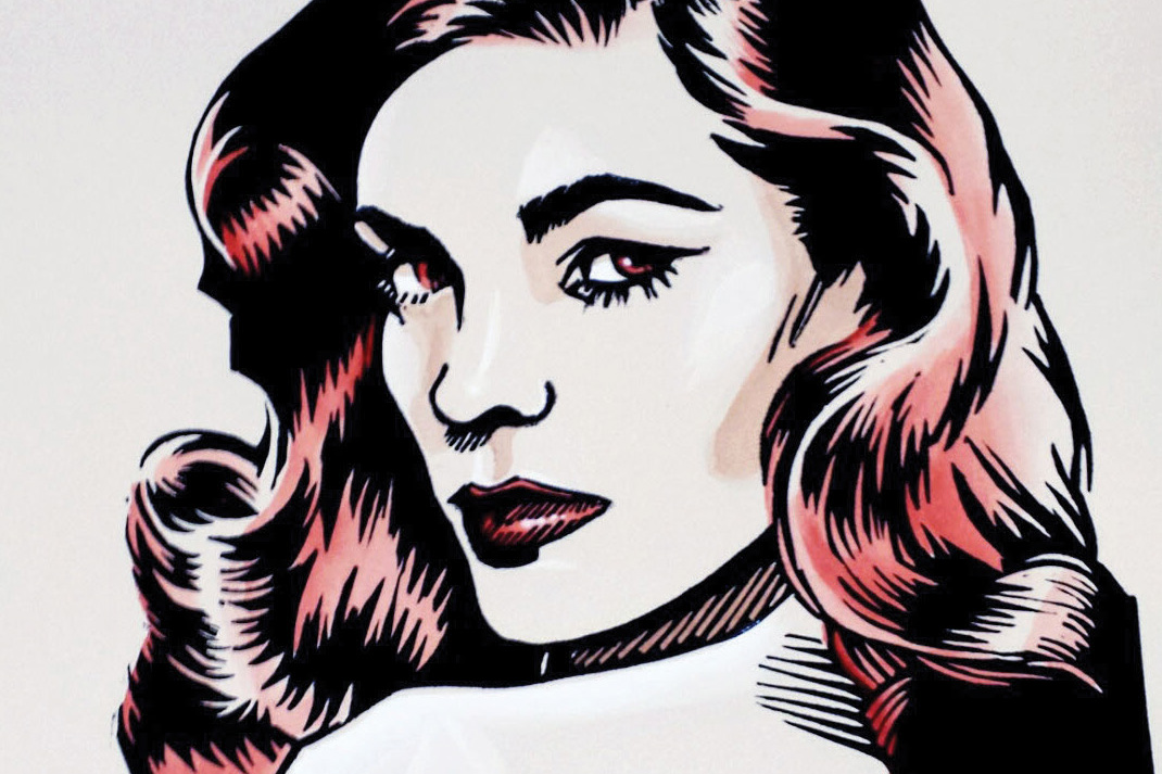
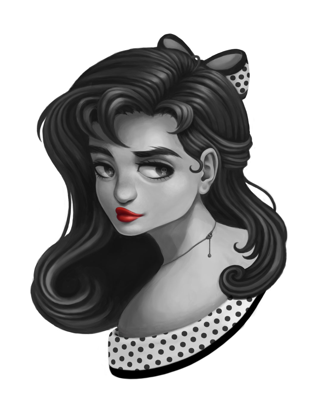
With this piece I wanted to capture the beauty of one of the most gorgeous classic movie actresses while emulating the line art style of vintage comics. 255957_
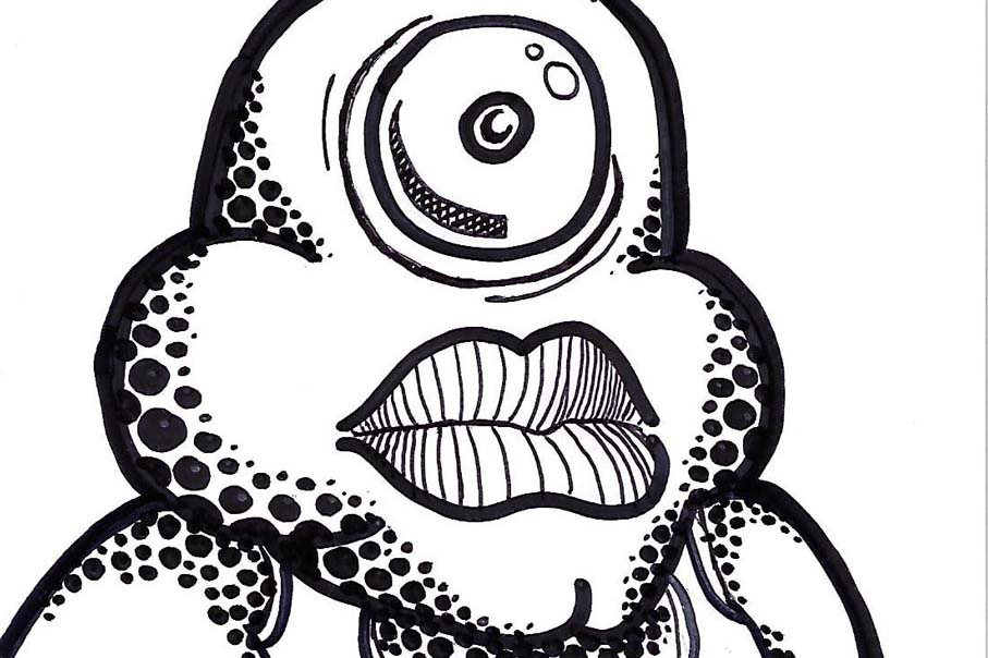
I used lines and shapes to create texture and value.
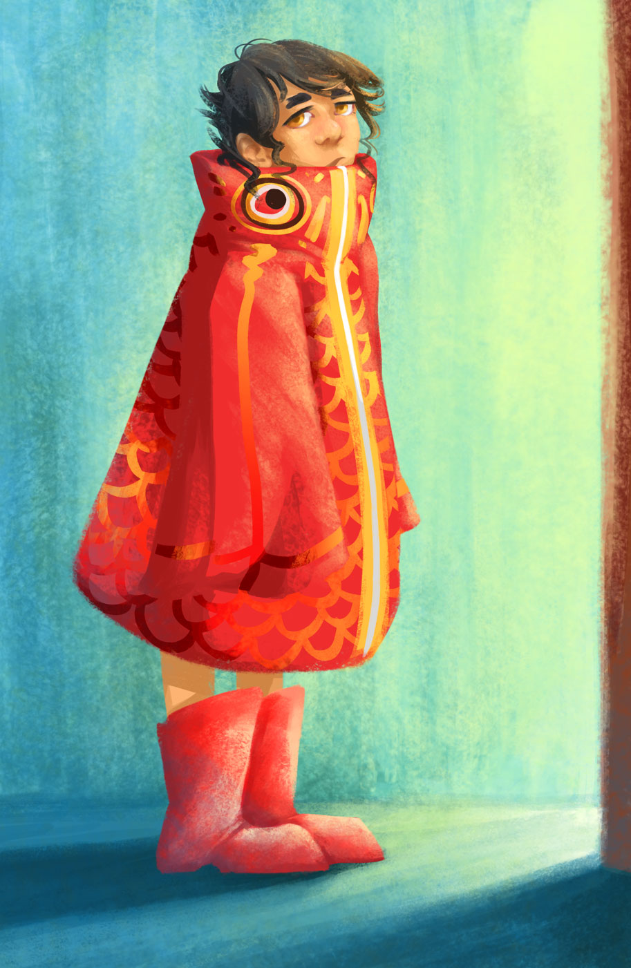
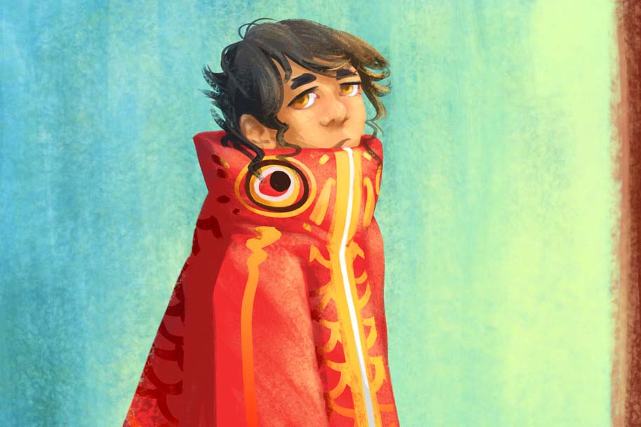
Just a small kid in a big fish coat.
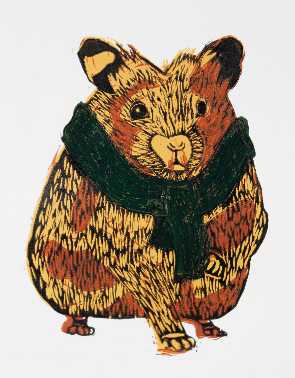
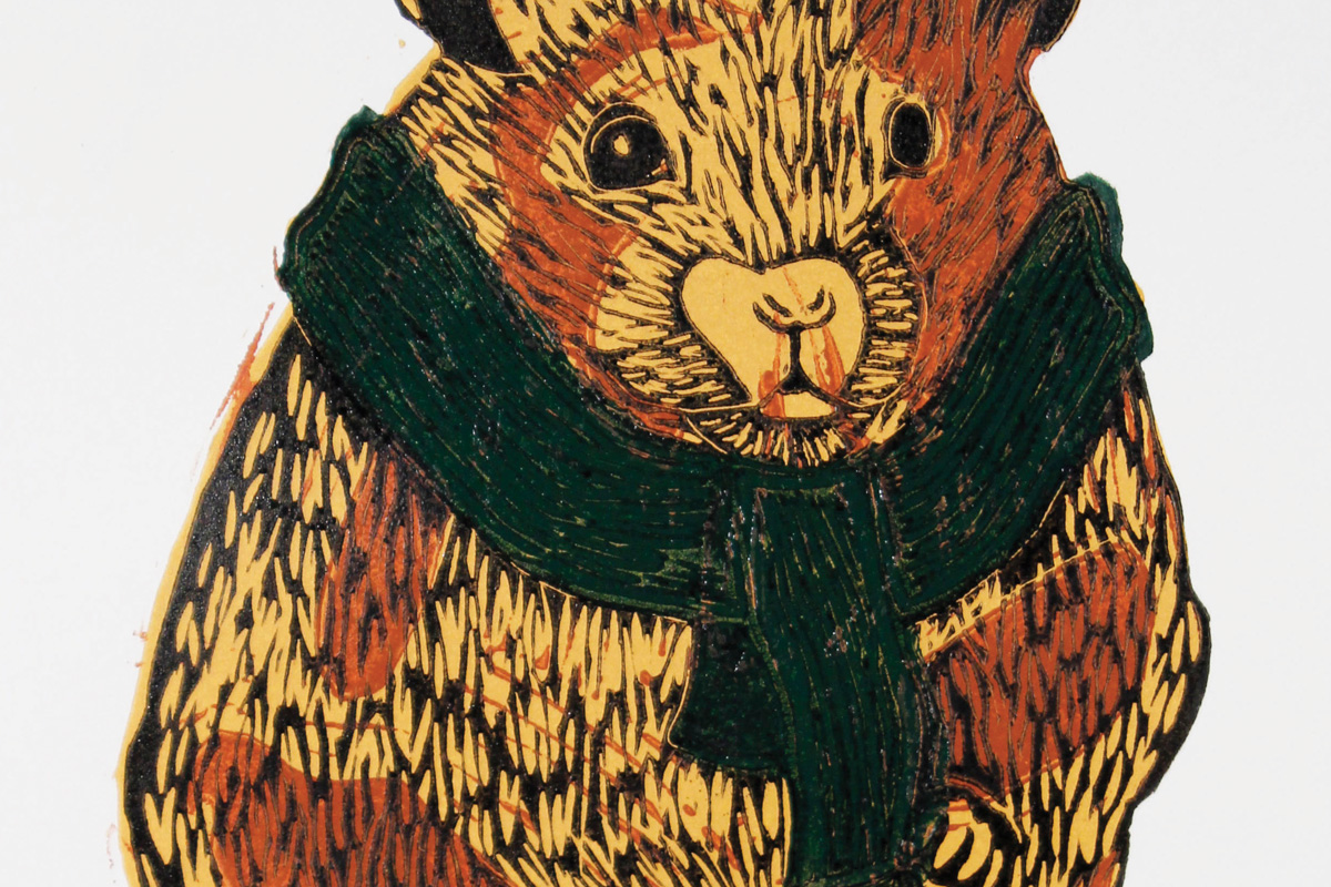
Bea is a hamster wearing a scarf. The image is made up of 4 different linoleum blocks printed separately over top each other. Each color is a separate block.